



Leaderboard
-
Seeker441
Members15Points21Posts -
BoddaH1994
Members10Points17,878Posts -
coaster sally
Members9Points1,101Posts -
WhatTheBlazes
Members9Points253Posts


Popular Content
Showing content with the highest reputation on 07/10/2020 in all areas
-
8 points
-
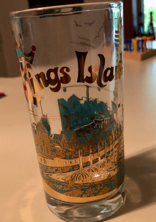
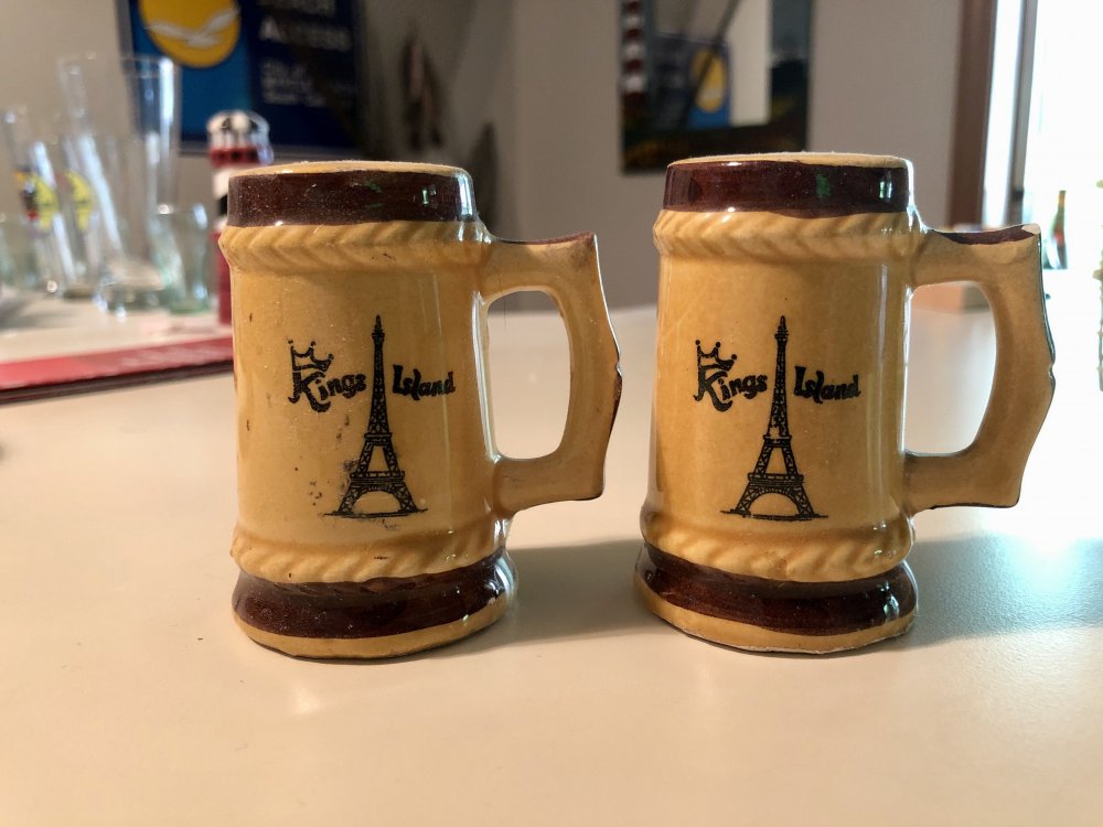
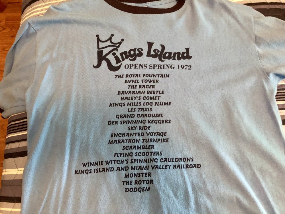
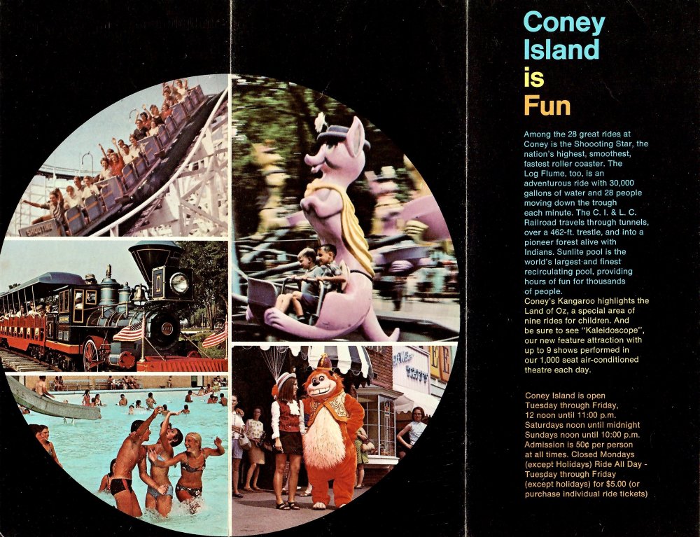
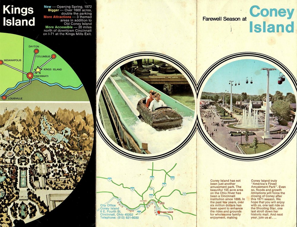
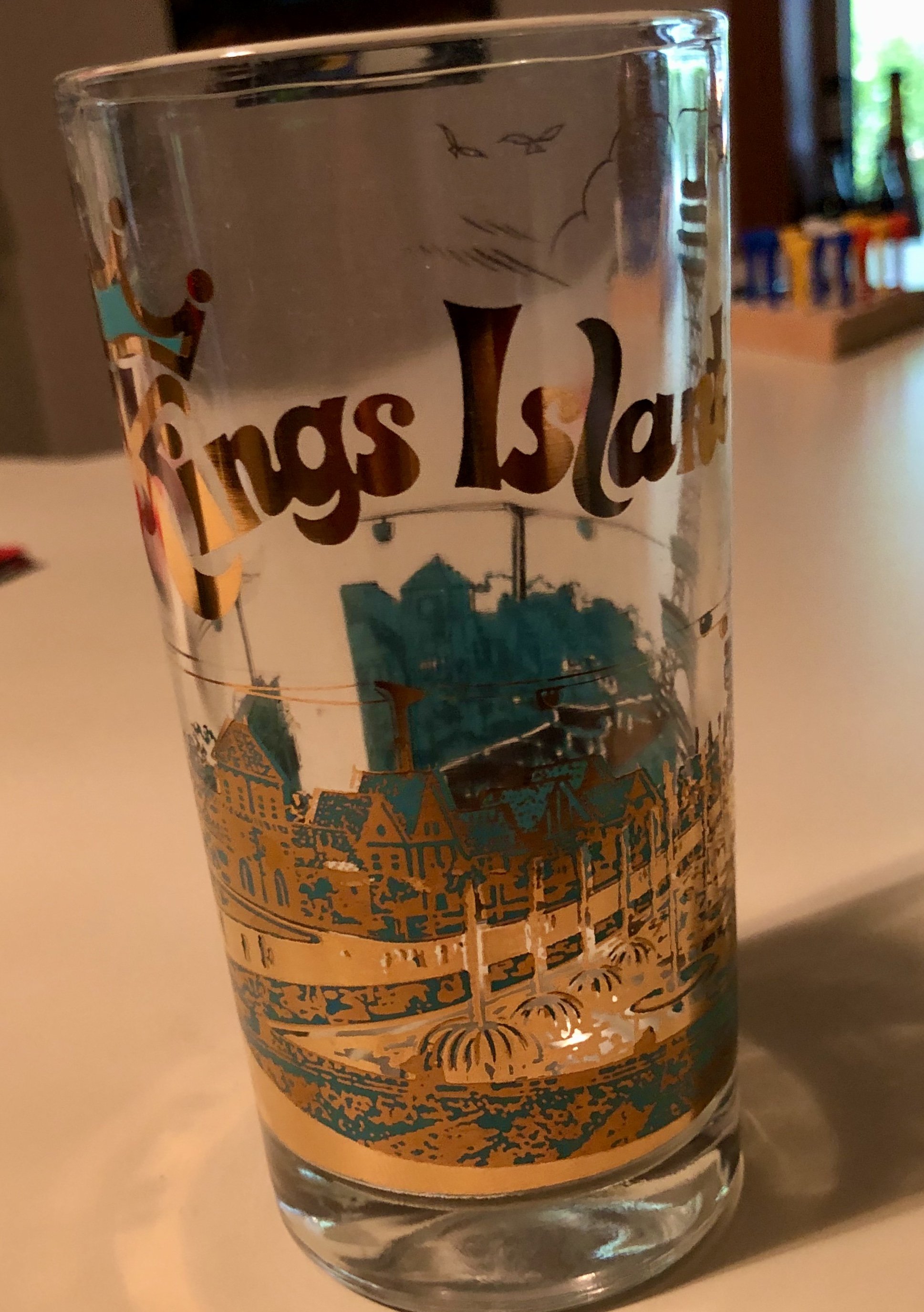
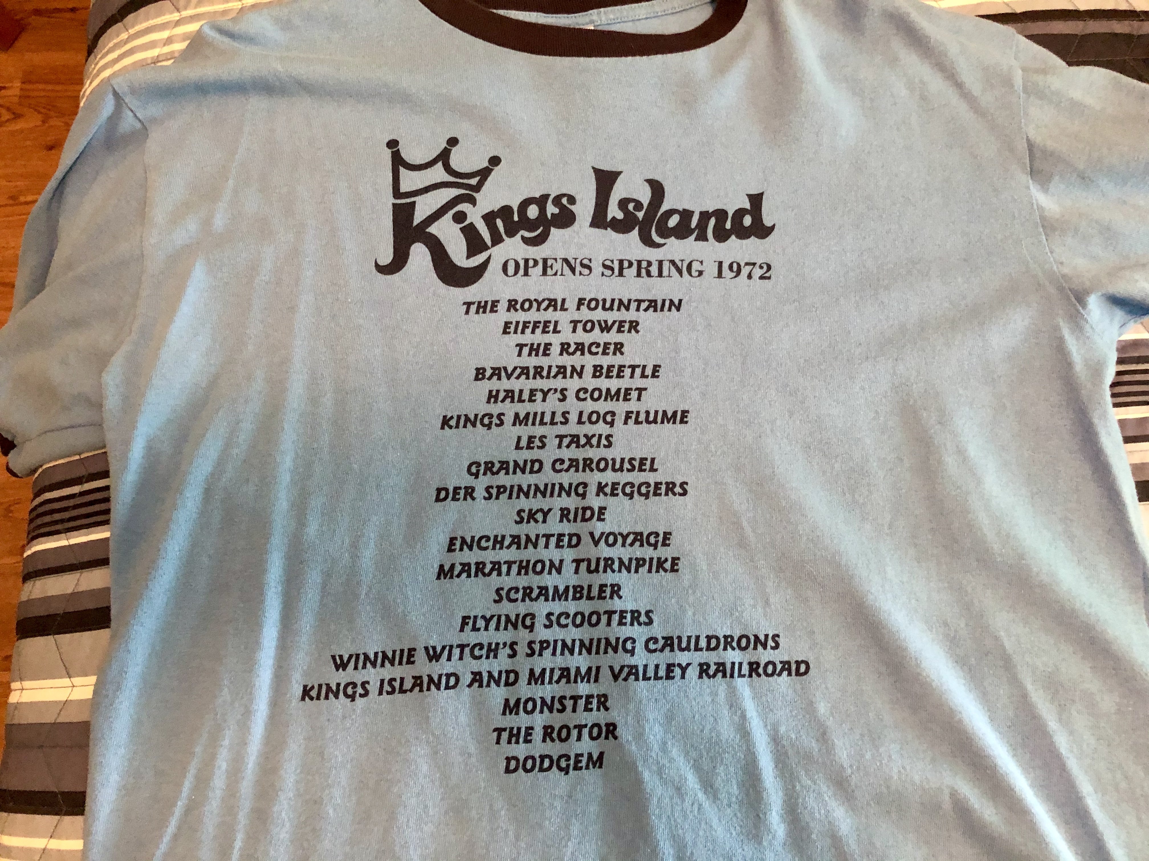
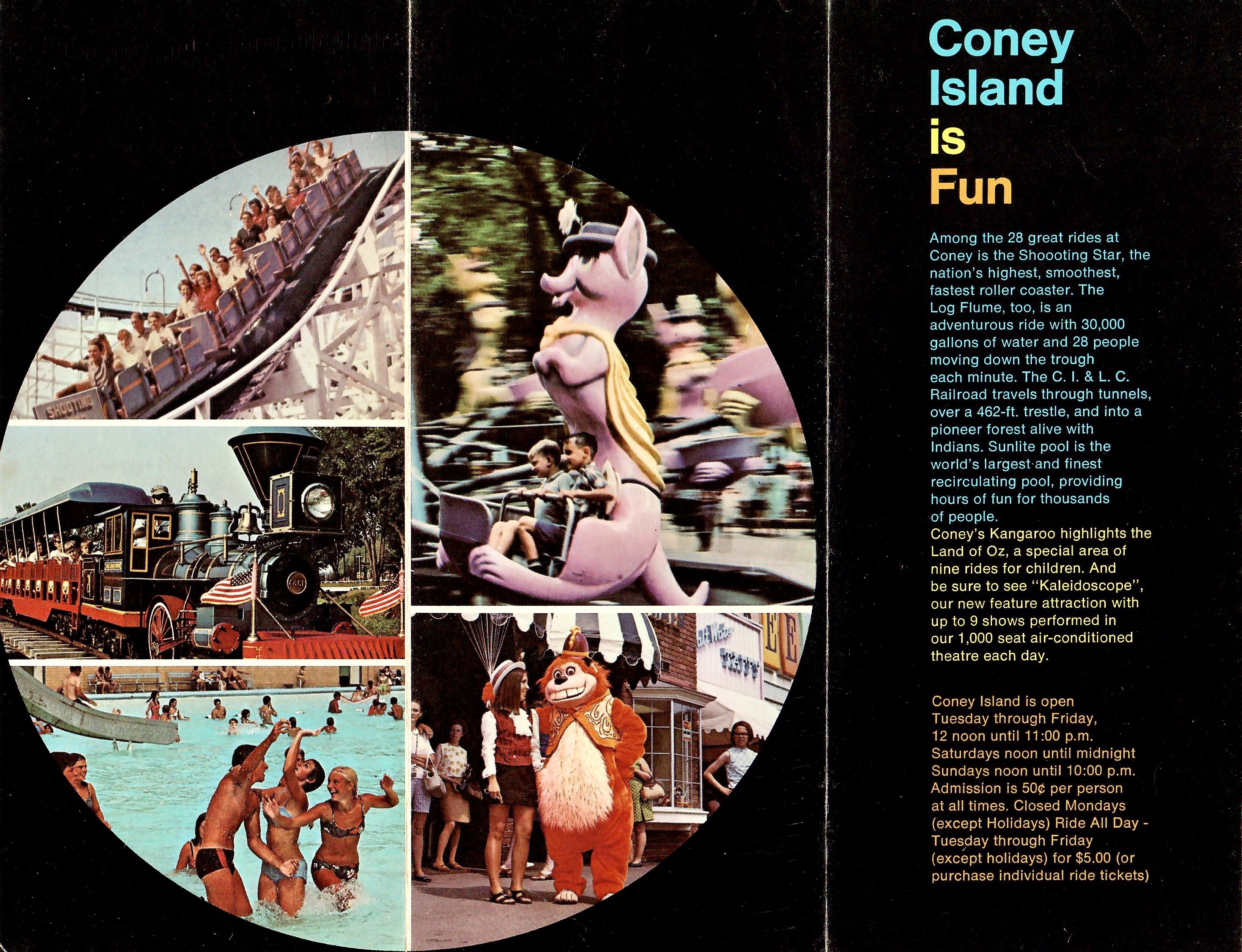
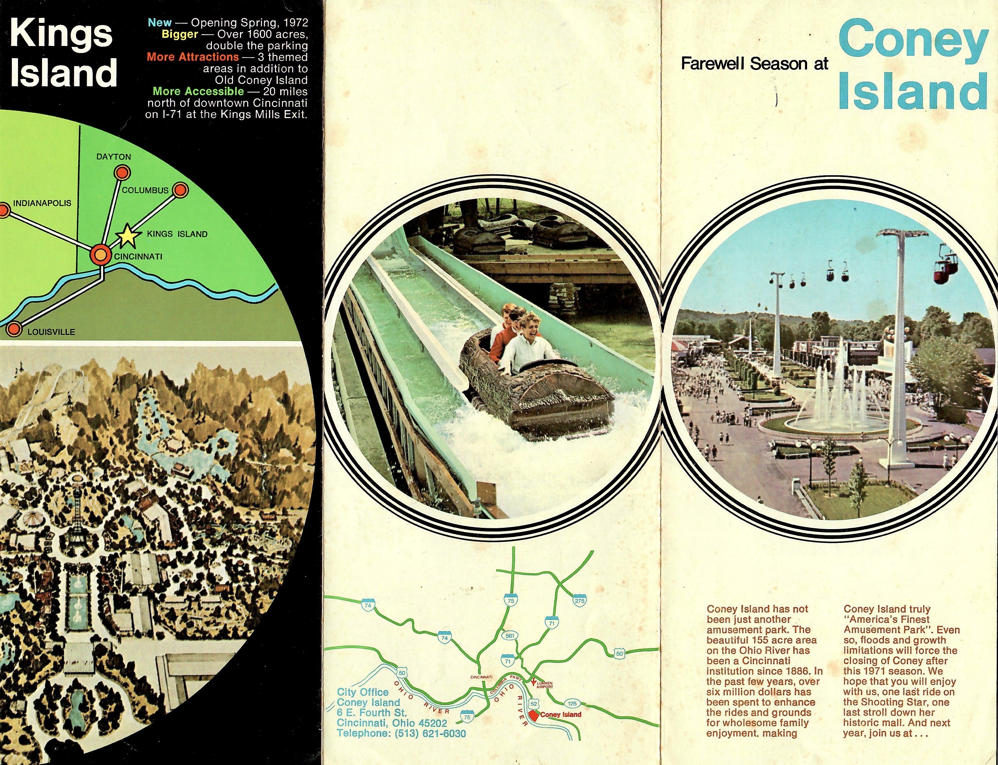
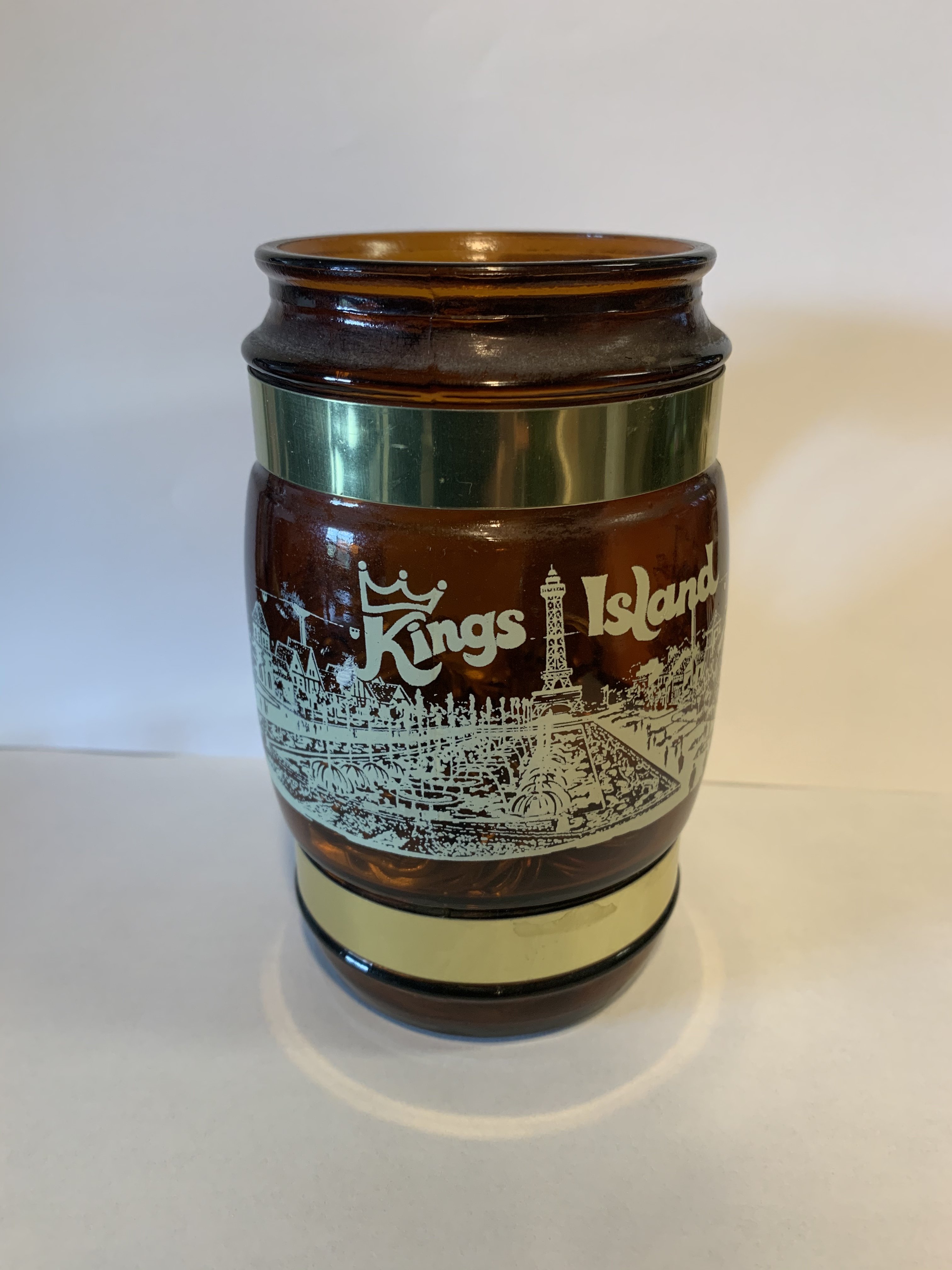
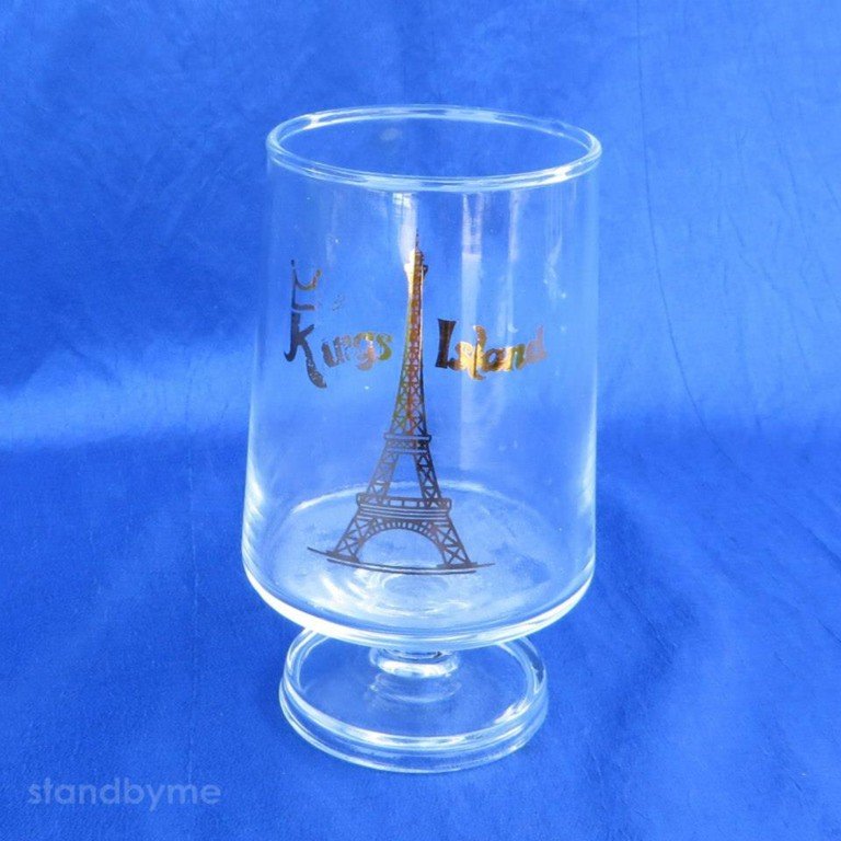
8 points8 points7 points6 pointsJust wanted to share a few things I have with the original KI logo...the glass and the salt and pepper shakers are vintage. The shirt was sold at Kings Island just a few years ago that lists original attractions. I've worn it to the park a few times. I've had associates ask me about it; a few thought it must have been vintage. it does have 70's vibe to it. Since the original logo was from the Coney/Kings Island continuation era, I scanned a Coney brochure that is from its final season. It doesn't have the KI logo, but it does reference the "new park".
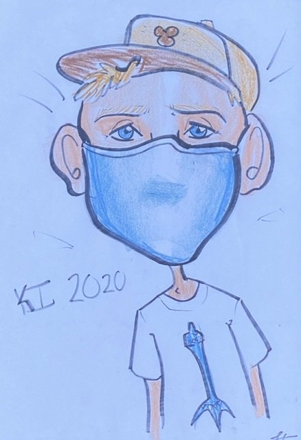
 6 pointsHey look ma I made it!5 pointsI made a solo trip to the park today. (The rest of my family didn’t feel safe attempting it.) My opinion...because I know everyone cares. I give the park credit, I think they have done ABOUT all that is possible to make the park reasonably safe...but in the end, you just can’t fix stupid...or arrogance. (It will be a job to enforce all of the rules if the park REALLY gets busy.) Here are 2 examples I saw today...I think the second one falls into the stupidity category...I’m not sure about the first one... Example A: I was next in line to enter the tent to have my temperature taken, I glance behind me...and I kid you not, a guy is within a foot of me! He couldn’t even make it through the “turnstiles” without breaking the rules...he did have a mask on though. (I swear, if I had a nickel for every time I’ve shaken my head at stupidity during my lifetime would have been able to outbid Cedar Fair for the parks back then. ) Example B: A mother and a daughter were walking down one of the “main drags” without masks on, drinking cups of water. An associate called them over to explain that they had to have their masks on. I felt so bad for the associate, what should have been about a 30 second conversation went on for about 3 minutes. The mom seemed to think that because they were drinking it was a “get out of jail free card”. (In my hometown, grocery store cashiers are receiving “hazard pay”...maybe the park should consider something like “stupidity pay”. ) I thought most people seemed to be wearing their masks properly...but I wasn’t purposely staring at everyone. Keeping masks on the little kids seemed to be the hardest thing...but it also seemed like parents were trying. I thought that most of the time people were doing a good job at social distancing...but, since the park wasn’t crowded it was easy. I did notice that people bunched up into a normal crowded line to collect their Orion ride tickets though...I just don’t know how many extra associates it would take to stop that from happening. My overall opinion, I wanted to be able to say that I experienced this COVID style Kings Island...and I don’t regret doing it...but, I didn’t think of something in advance that I should have...“this” Kings Island would be lacking one of the main ingredients of why I visit the park...escapism from the real world...unfortunately, it followed me to the park. I hope the park can make this work...I don’t envy them. I did pick up quite a few souvenirs...because as @BeeastFarmer said earlier “because you help people when they are down.“ (That, and I love all of the new pins! ) Out of everything I bought though, I thought this souvenir summed up a trip to Kings Island in 2020 perfectly! (The idea of getting a caricature now just seemed so ludicrous...something I’d expect to see in a “Naked Gun” or “Airplane” movie.
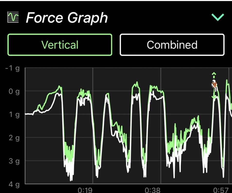
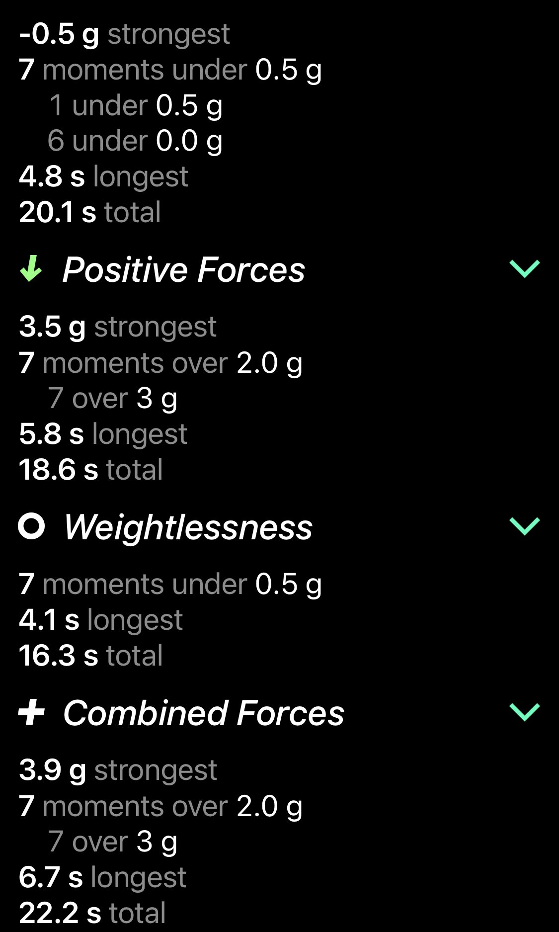
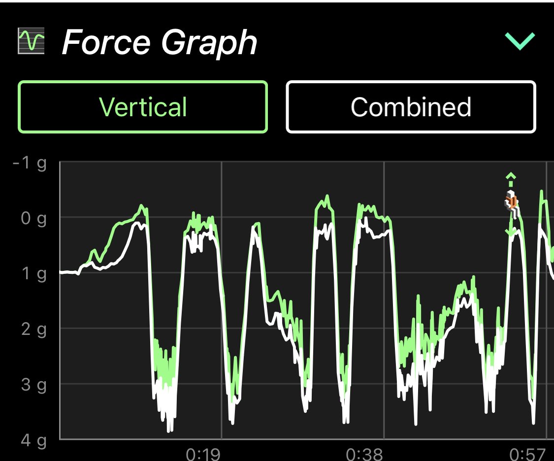
 5 points4 pointsJust for fun, here is the data from Ride Forces, combined front and back row: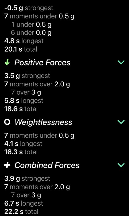
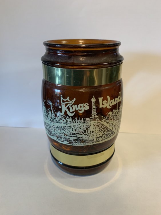
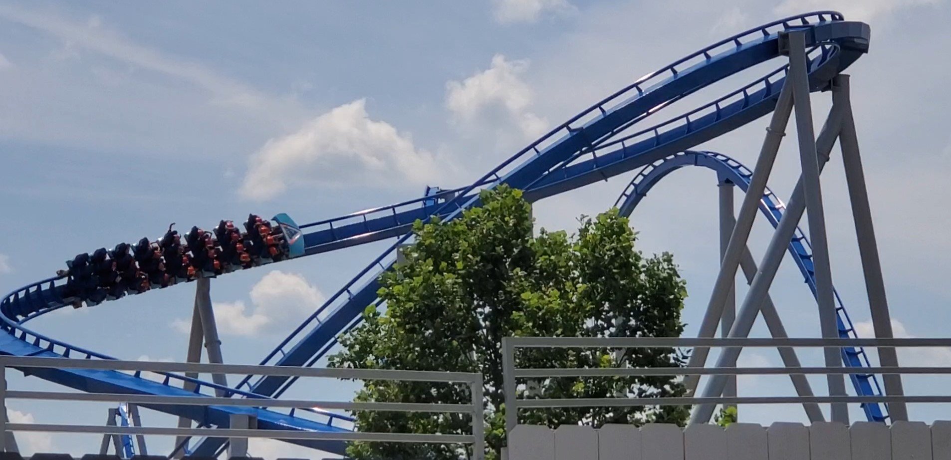
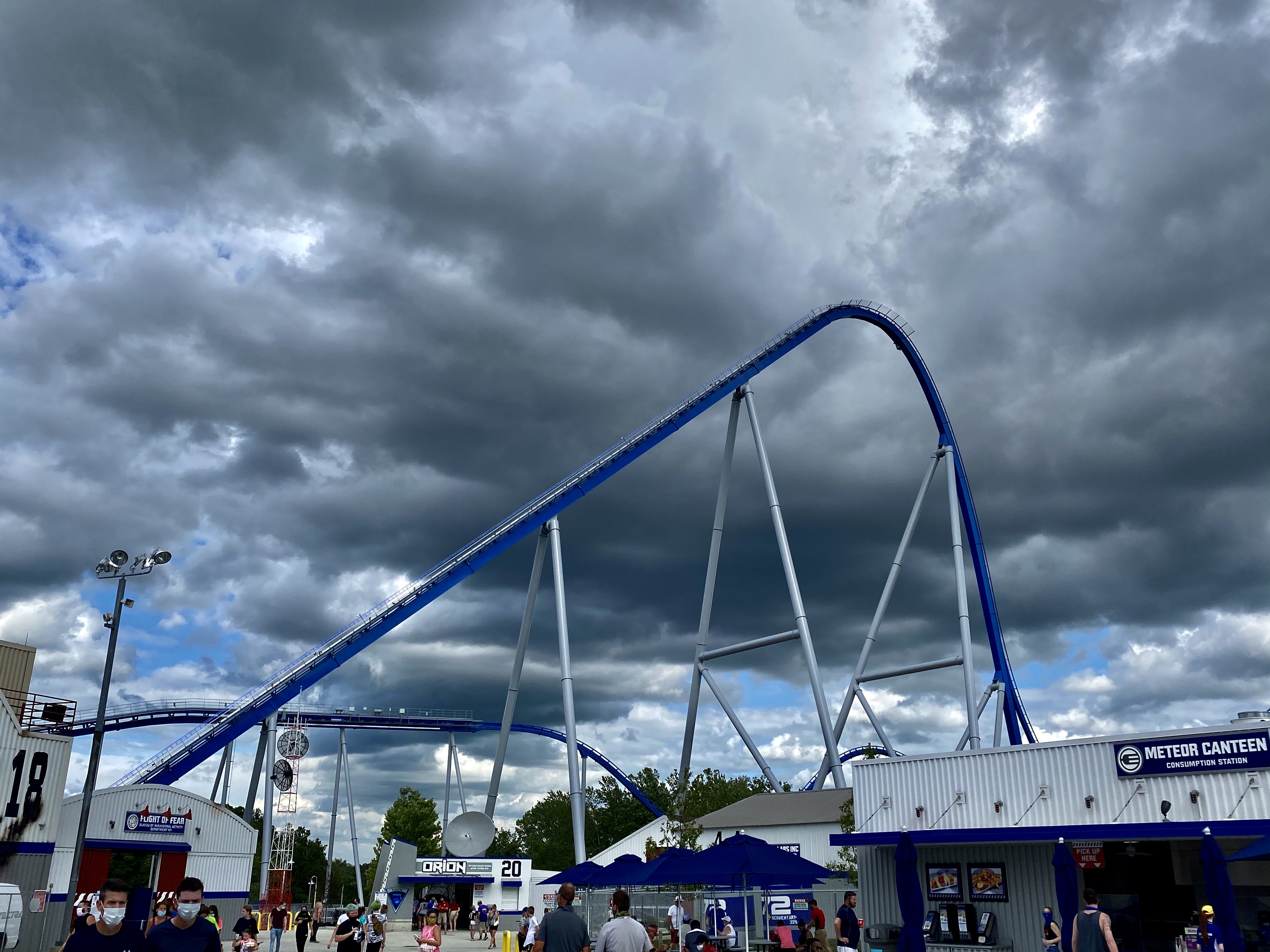
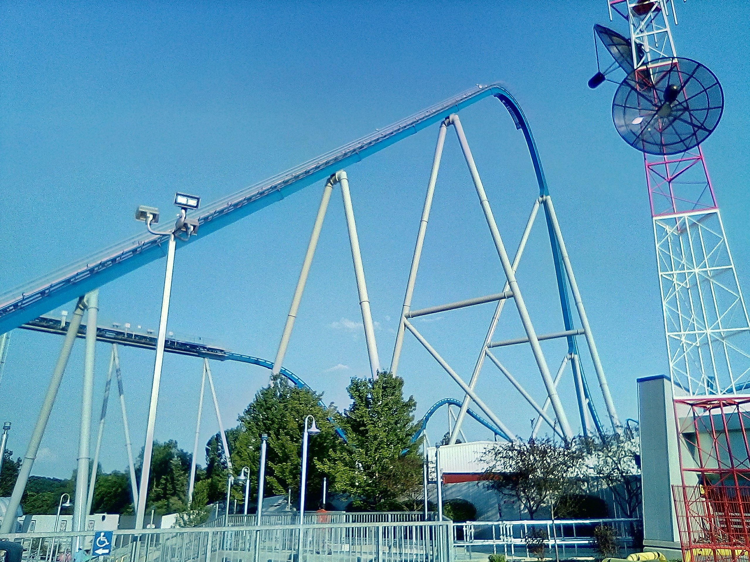
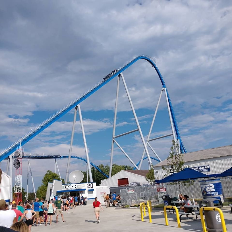
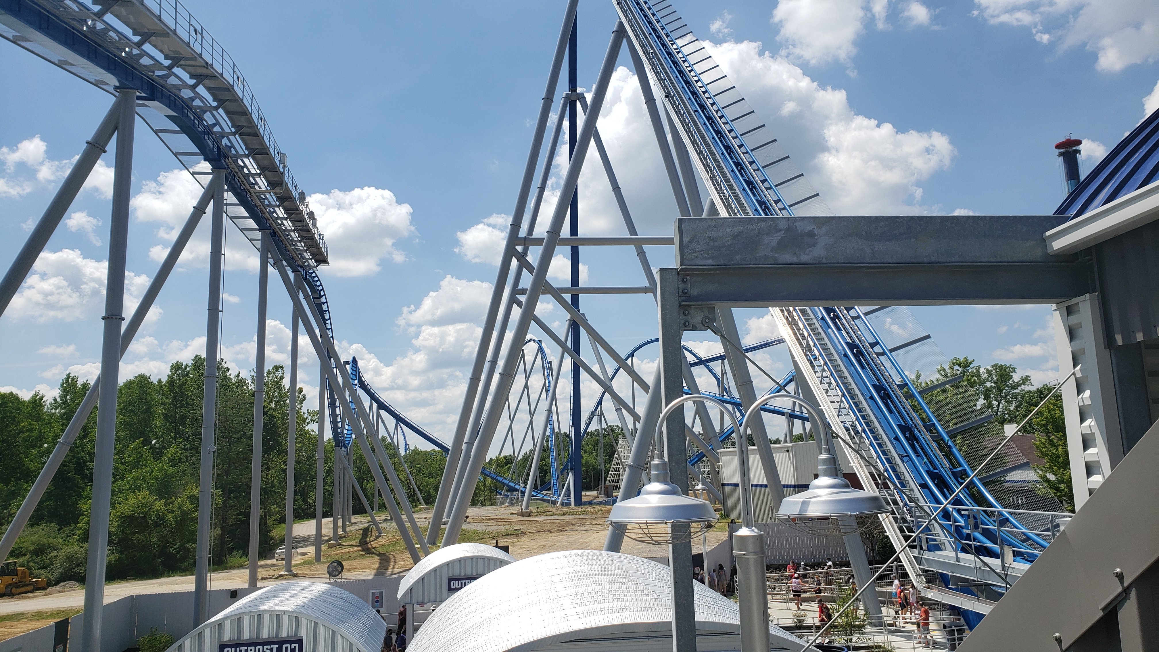
 4 points4 pointsWe were at the park today -- came thru gate at 1050, my 14yr old son and I bolted to grab Orion passes while my wife and 11yr old son went to wait for Mystic. Got my 11-12pm window pass for Orion, and thought we'd go ride Mystic first with the others before coming back to make our window -- and we managed two rides on Mystic, two rides on Diamondback, *and* got back to Orion at 1145 for a walkon to row 2. ( Also, FWIW: the 11 yr old has decided he has 'graduated' from Flying Ace Aerial Chase, and is now Team Banshee. He plans to write a farewell letter to the Flying Ace ride ops. )4 points4 pointsI have now read dozens of comments around the internet on how Orion may have the best drop out of all the giga coasters. Everybody who has ever called Orion a "hyper" can officially insert foot in mouth now.4 points3 pointsIf we’re sharing our original logo souvenirs, I’ve had this for a few years now. I don’t remember if it came from an antique shop or eBay though.
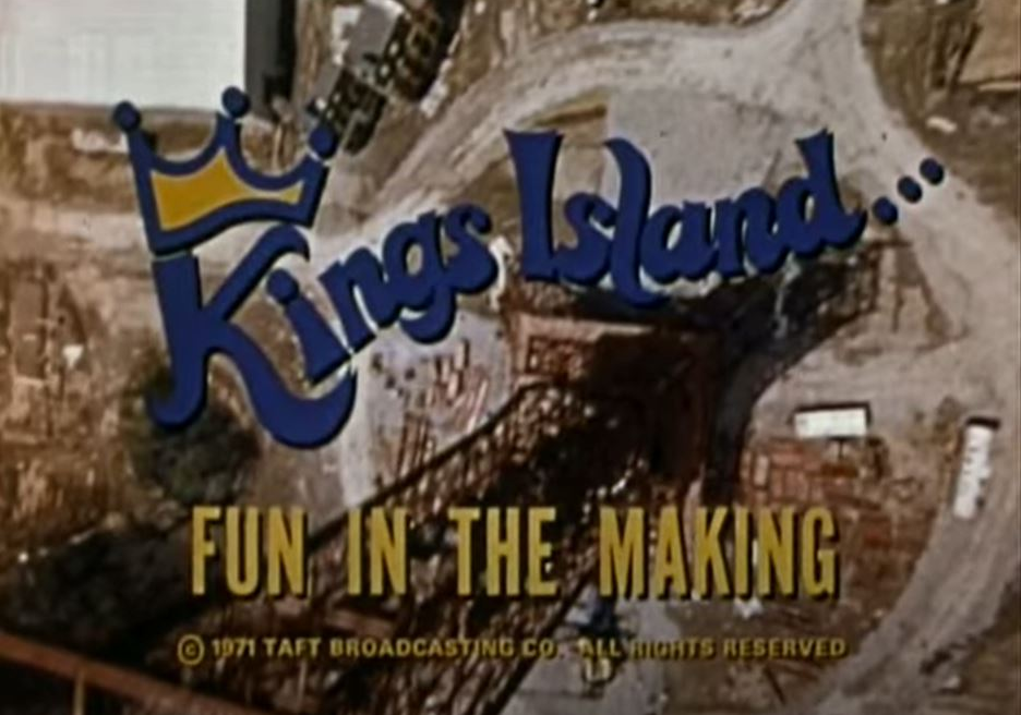
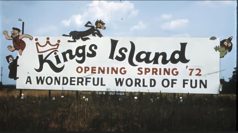
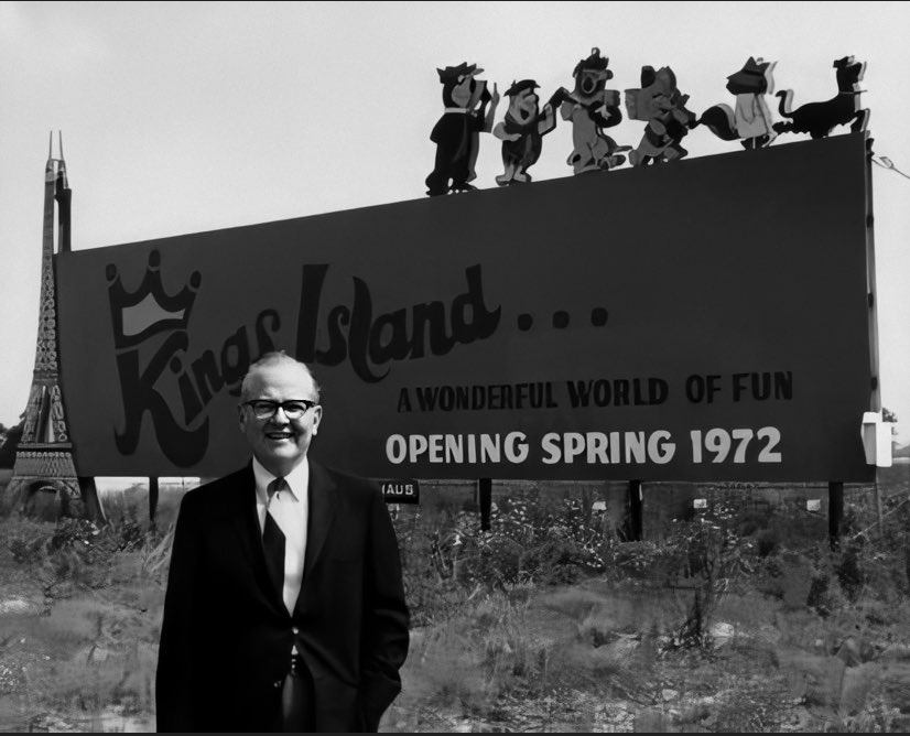
 3 points3 points3 pointsTrue. I just can’t see 7 days a week continuing like this. I mean it’s glorious for a park goers who doesn’t mind a mask, but this HAS to be killing overhead. I’m SO IMPRESSED they even swapped out the flowers on the flower carts and all the 4th decor from Monday. They aren’t “cutting corners” with a lot of this.3 points3 points3 points3 points3 points3 points3 points3 pointsGuess kentucky kingdom is requiring face masks now. https://www.wkyt.com/2020/07/08/state-reports-400-new-covid-19-cases-6-new-deaths-on-wednesday/3 points3 pointsThe Kings Island "Crown" logo was used through fall 1971 to promote the park. By December the new, more familiar, "Disneyland font" logo was in place. (More about that in a minute...) Ads for the KI preview movie that played local theaters used the new logo as early as Jan 1st. However the movie itself was produced in 1971, and used the "Crown Logo" in it's title shots. Here are samples of the logo in the variations of the "preview" brochure that was distributed before KI opened. There were at least 3 variations of the brochure. The first (far left) was distributed at Cincinnati's Coney Island at the preview center in early summer 1971. The second version was also distributed at the Coney preview center late season/August 1971. (It names the Jack Nicholas designed golf course at Kings Island which was announced in August 1971.) The third brochure was distributed at the information centers after Coney closed (note the original planned opening date of May 6th which did not happen.) As you can see, the second logo was in place for this brochure. The new logo was developed, as I understand, in fall 1971. It utilized a variation of what's become known as the "Disneyland" font. It *may* have been suggested by Bruce Bushman, who did quite of bit of concept work for the park. (Mr Bushman was one of the original WED Imagineers responsible for the original design of Fantasyland for Walt Disney. He was instrumental in also designing Kings Island and, no doubt, patterned parts of KI on it.) The new logo could also have been a "nod" to the fact that Kings Island - when it was being announced/built - was being billed by many as Ohio's version of Disneyland. While the park was under construction, there were 2 different billboards placed by the interstate to mark the location of the park. The first billboard featured the "Crown" logo. The second also used the "crown" logo as well - but the Eiffel Tower had become part of the advertising campaign. Here are pictures of both billboards courtesy of KI50MOVIE... Its worth noting that ALL advertisements of Kings Island at Cincinnati's Coney Island used the "Crown" logo. Including the "Racing Coaster" billboard that sat adjacent to the Shooting Star's station. By the time KI opened in May, the "Disneyland" font version of the logo was the only one being used for advertising purposes. The confusing matter is, the "Crown" logo still cropped up on merchandise and shopping bags etc. That (very likely) included the "Tiki Mugs" mentioned here. The reason? Because many orders for merchandise and various items were placed prior to the logo change to meet manufacturing timeline requirements. BTW - the "Crown" logo still crops up as a "throwback" on merchandise from time to time. For instance, this season there is at least one item (a slinky toy) that features the "Crown" logo being sold in the shops on International Street. For posterity, I think the switch to the "Disneyland" font logo including the Eiffel Tower was an excellent decision. Its far more iconic and dynamic than the "crown" logo. Frankly, I still prefer it to any logo the park has used since - including the Paramount version and the current Cedar Fair version.
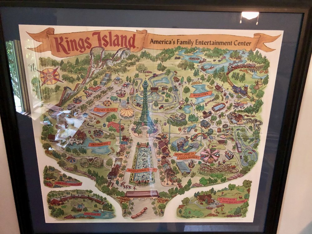
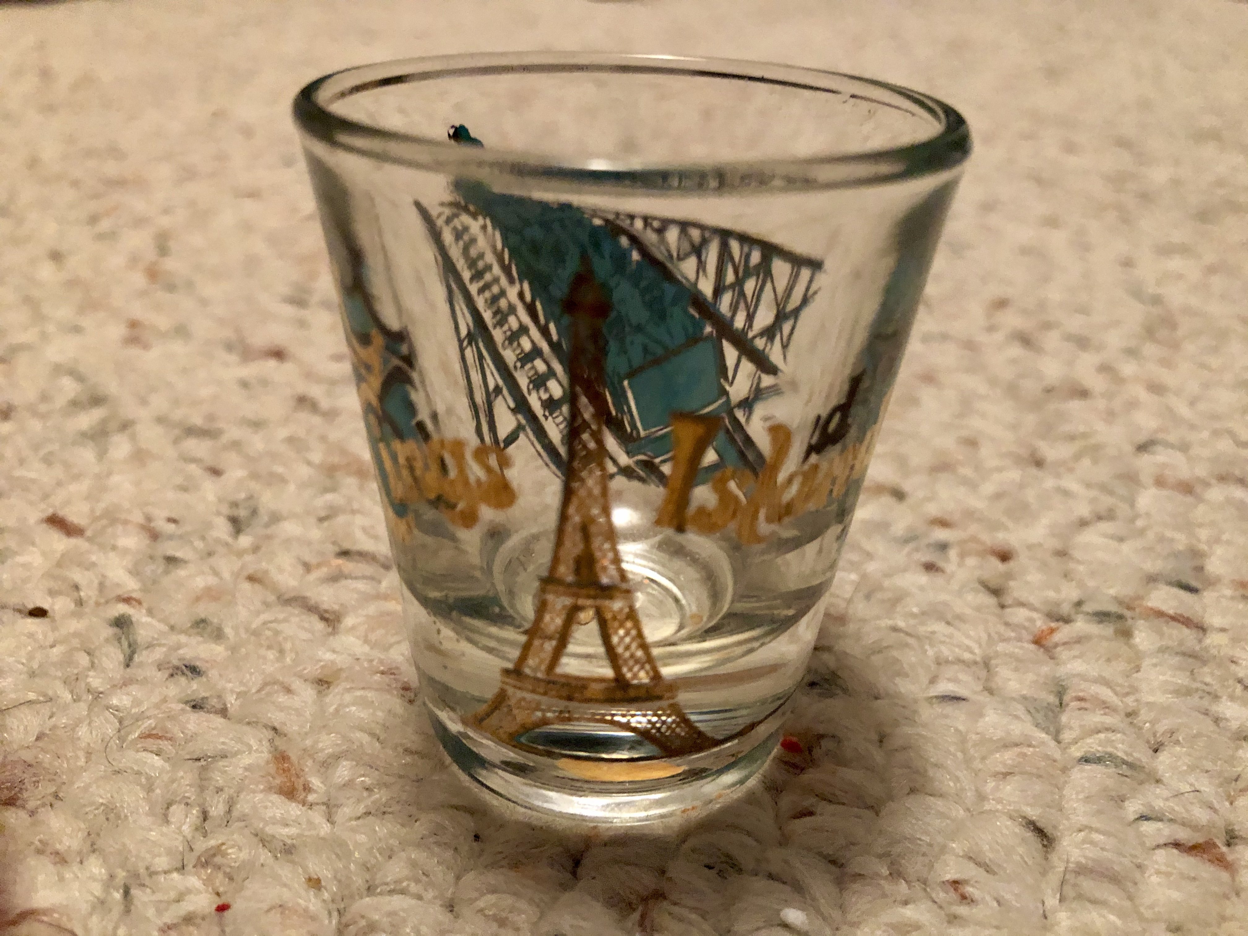
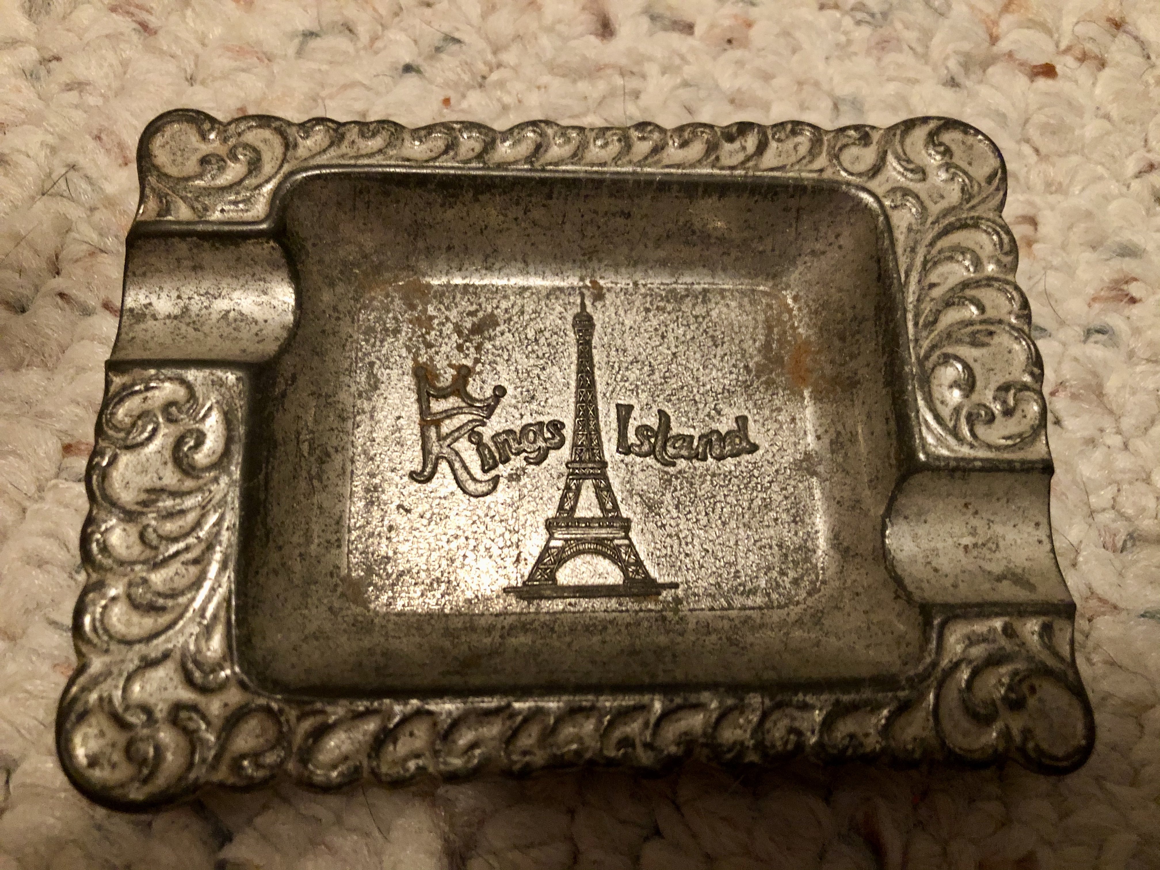
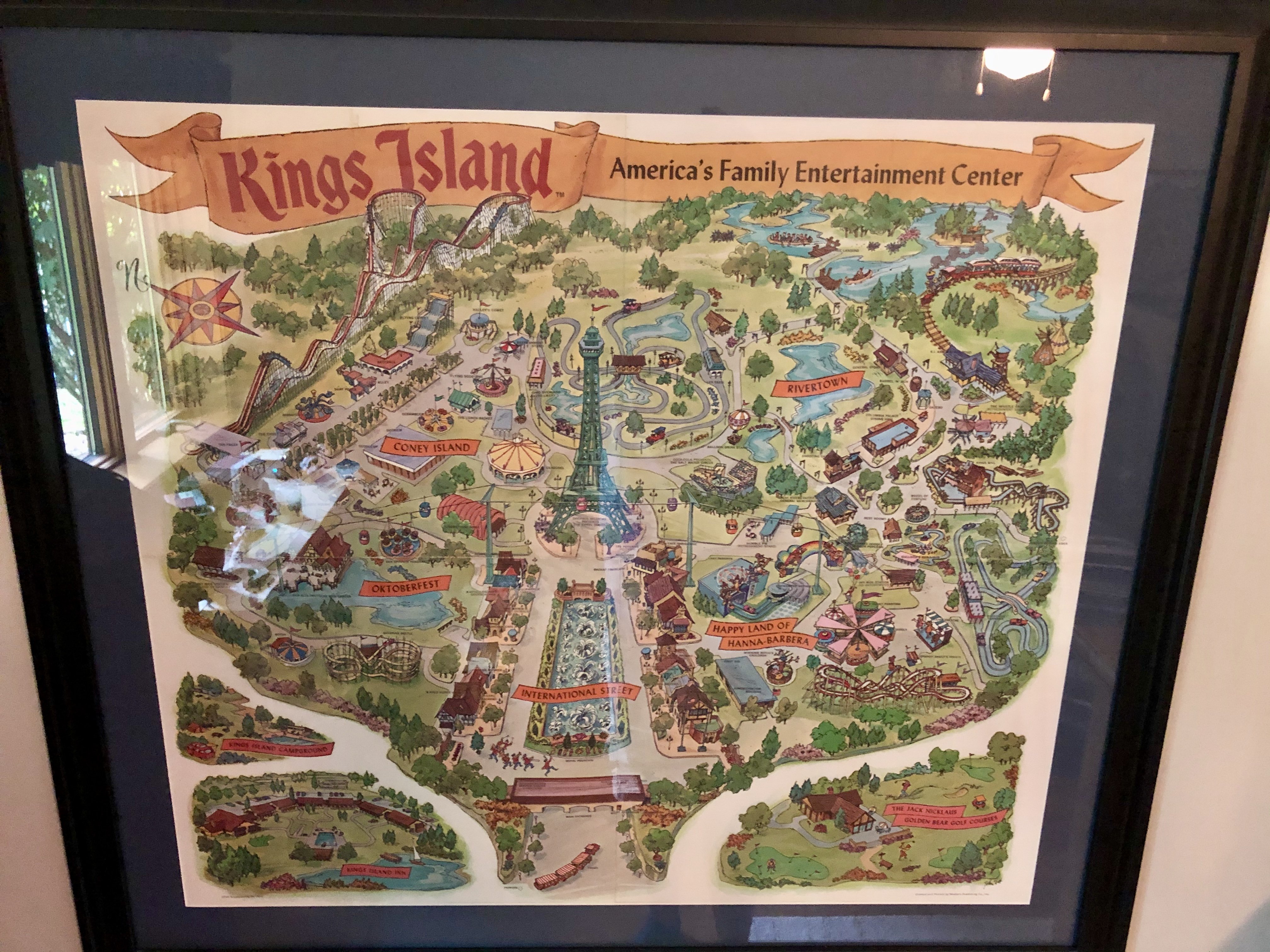
 3 points2 pointsI do too beeastfarmer! I wish I had kept all the souvenirs and maps. My first trip was with my 8th grade class in 1973. Oh how I especially wish I had kept the maps. We would go over them for hours after each trip reliving every step and thrill. Great times2 points2 pointsNew this season, Afterburner fries. Deep fried jalapenos drizzled with a sauce heavily laden with California Reaper extract. It's sure to blow you out of this world one way or another!2 points2 pointsAccording to the dictionary they should just shoot out of you quicker with increased thrust, but cannot confirm.2 points2 pointsThis may be a great place to put this: https://www.visitkingsisland.com/blog/2020/july/kings-islands-orion-roller-coaster-a-story-driven-attraction2 points2 pointsI haven't been through my KI stuff for awhile, and came across a couple more items with the original logo...two of everyone's favorite items to remember their Kings Island visit: a shot glass, and an ashtray. Also, it doesn't sport the first logo, but the map pictured is from, what I understand, the opening season.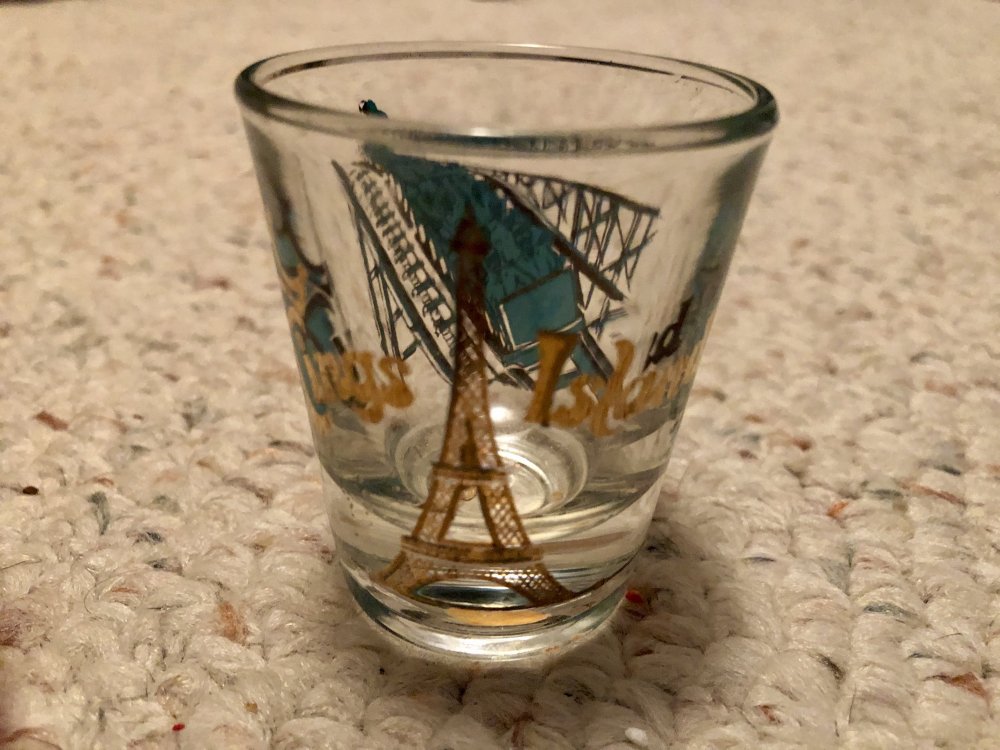
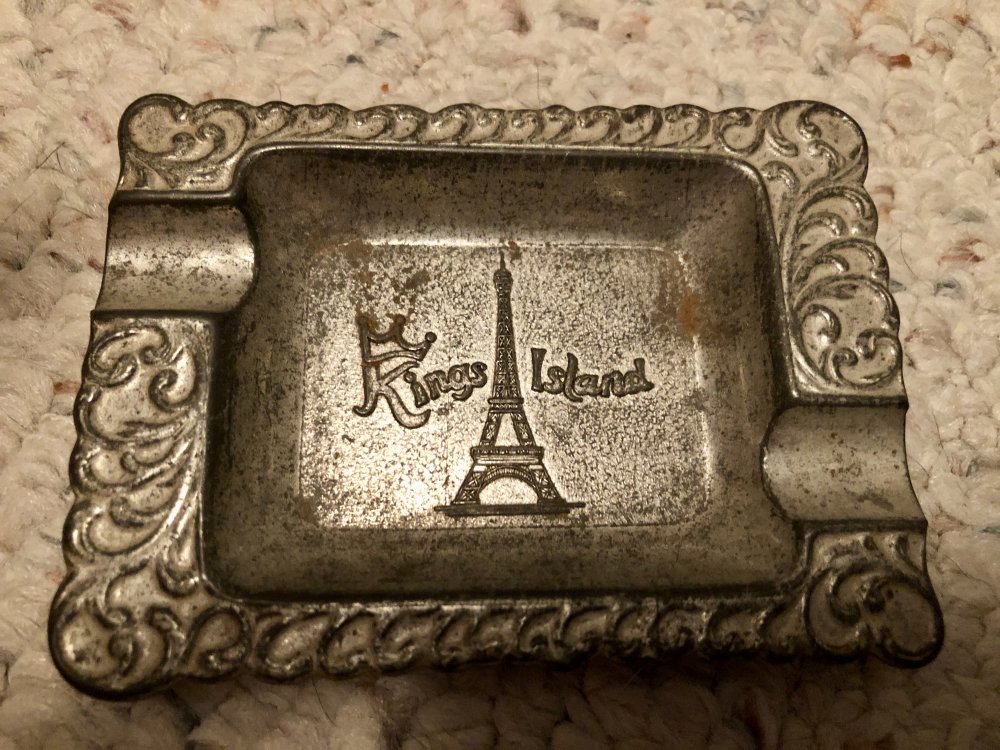
 2 pointsYep. And that's certainly intentional.2 points2 pointsNot to go off topic too much, but regarding the different logos... does anyone remember in 2007 when the park just removed the Paramount's part of the fountain marquee and left the bottom half in place? I'm assuming @BeeastFarmer is referring to souvenirs with a similar set-up, which I think I saw a few of last year. Regarding the tiki mugs... @TikiDan151 thanks for sharing! I don't have anything to add that others didn't already cover - that logo wasn't used on park publications 1972 onward, but it's on some early merchandise. As @standbyme put it - it was "like the park just bought an item from a wholesaler and slapped their logo on it."
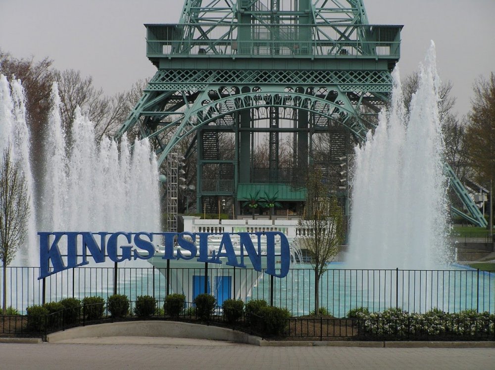 2 pointsThis will date me. But my favorite memory is riding Zodiac and hearing the music from the Coney Island Disco. Every time I hear a disco song to this day I think of that ride and Kings Island.2 points2 points2 pointsA pre-paid Visa "gift card" can generally be charged as either credit or debit, just like a debit card for a checking account. Anywhere that takes Visa cards should accept them no problem (KI included). As mentioned above, also take a look at the All Day Dining and refillable Souvenir Bottles. Cash should still be accepted but it is highly discouraged.1 point1 point1 point1 pointSee, I was wondering if they were just deep fried jalapeños.1 point1 pointAnyone tried this yet? Looks very good . Per @chuck norris above it does not seem to be on the meal plan.1 point1 pointThe virus has been more "real" in that area. Places like Indiana think of it as a hoax and a political stunt.1 point1 point1 point1 pointWas giving rain today as well wasn't it? It is sad walking into the park during a pandemic. Seeing everyone wearing masks. I hope we get through this together. All the employees I have interacted with thus far in multiple parks have all been great.1 point1 pointWasn’t there a user here called Captain Nemo that done flyoverS of KI around 2005? Am I guessing that Easter egg wrong?1 pointCheck this out:1 pointSorry about that @Outdoor Man. I envision a new ride there with the entrance plaza across from the BLSC entrance.1 point1 point1 pointKings Island officials felt that the first logo was not an “easy to use or read” logo, so they changed it. The logo was changed in, I believe, early 1972—someone probably knows more about the specifics of the date. By the time the park opened, they were using the medieval-looking one as the official logo of the park.1 point1 pointWe were at the park yesterday and have ridden Orion already so it was not a priority, but we wanted to explore A72. We did ask the associate who was distributing ride vouchers (even though they were all gone for the day) if she had any previous vouchers that we could use as scrapbook souvenirs. She was nice enough to look through her stash and give us each a mint condition voucher from earlier in the day.1 pointAnd you are no different then the person who hides a zombie bite. A vaccine is for herd immunity for those who can't get a vaccine for medical reasons. Let me tell you about my buddy from the preschool I volunteer at, his name is Buddy*. Buddy has had a heart transplant and has since started to reject it. He is on immunity blocking drugs and the common cold could kill him. Buddy has been isolated with his mother as he can't even risk having a family member expose him, which means the last time he hugged his father or sisters was early March. We don't get vaccines or wear a mask for ourselves, we wear a mask and get vaccinated for Buddy and everyone else like him who want to be safe but can't and are counting on us to help keep them safe. I support your right to not get vaccinated, but if you choose to not take others health seriously, then please stay home to help keep those of us safe who are trying and doing our part.1 point1 pointFor Leviathan, they added 600 pounds to the trains last season, and this extra weight greatly increased the speed of the ride. In Orion’s case, when it is running at half capacity or less, that is the reduction of 16+ riders which is probably about a reduction of 2,000 pounds. Without a doubt, Orion would run faster at full capacity.1 pointI'm currently on day 2 marathoning the heck outta Hades 360. 8 rides yesterday. 11 and counting today. Went to the Pizza Pub across the street last night on my birthday. Got draft beer all night free and got to keep the mug too. My chicken parmesan was real good and he threw in a slice of chocolate cake for free. Editing this to say I rode it 20 times today in 6 hours and called it a day.1 point1 point1 pointBeer gross and look nasty dad calls it bull **** and he says drunk driver drank beer and the story ghost guy said the guy died on efel tower after drunk on beers1 point1 pointWasn't there polka music in the area as well in addition to all of the things you mentioned? I feel like there was and all of it really made it feel like you were in a festival somewhere else. It was a nice feeling of "escape" either way.1 point1 pointYou know what would be a great improvement to Viking Fury? Bringing back the "Tastes Great, Less Filling" chants. My Mom told me she used to do that as a teenager on Viking Fury.1 pointThis leaderboard is set to New York/GMT-04:00










.thumb.jpg.7151e82ec80195bbd68677ab7c410841.jpg)





Background Picker
Account
Navigation
Search
Configure browser push notifications
Chrome (Android)
- Tap the lock icon next to the address bar.
- Tap Permissions → Notifications.
- Adjust your preference.
Chrome (Desktop)
- Click the padlock icon in the address bar.
- Select Site settings.
- Find Notifications and adjust your preference.
Safari (iOS 16.4+)
- Ensure the site is installed via Add to Home Screen.
- Open Settings App → Notifications.
- Find your app name and adjust your preference.
Safari (macOS)
- Go to Safari → Preferences.
- Click the Websites tab.
- Select Notifications in the sidebar.
- Find this website and adjust your preference.
Edge (Android)
- Tap the lock icon next to the address bar.
- Tap Permissions.
- Find Notifications and adjust your preference.
Edge (Desktop)
- Click the padlock icon in the address bar.
- Click Permissions for this site.
- Find Notifications and adjust your preference.
Firefox (Android)
- Go to Settings → Site permissions.
- Tap Notifications.
- Find this site in the list and adjust your preference.
Firefox (Desktop)
- Open Firefox Settings.
- Search for Notifications.
- Find this site in the list and adjust your preference.