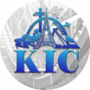
August 31, 201213 yr As we all know, Kings Island got the 40th Anniversary logo courtesty of Cedar Fair. Well, typical Cedar Fair, they appear to be cloning this to Worlds of Fun for their upcoming 40th, too. http://midwestinfoguide.com/ace/coastermayhem/2012/20.jpg I'm a little upset by this. It is virtually the same logo as ours (switch out a couple rides and the color scheme), plus it loses our special-ness of having a unique logo (if only for 1 year). What do you all think?
August 31, 201213 yr To me it's not that big of deal. All of the park logos are the same minus the park name, but the same style of font and the flag dotting the i.
August 31, 201213 yr Author FORBIDDEN. aka link doesn't work. Works fine for me. EDIT: Got it for ya, Terp.
August 31, 201213 yr 403'd http://www.worldsoff...new/new-in-2013 has the logo and the announcement. Interestingly, they're going to a single ticket for both the dry and wet parks. This will certainly make admission simpler for guests, but I hope the waterpark expansion is big enough to handle the crowds generated by this model. The website probably prohibits third party image links, so anyone who clicks to the image from here is instantly 403'd until they refer from the correct site.
September 1, 201213 yr A Soak City like sign, shocking clone.. Oh and a clone of our enterance, well this is even more shocking.
September 1, 201213 yr Wow, hate to go off-topic or anything, but the Waterslide complex shown on that page looks awesome...
September 1, 201213 yr I wonder, by what metrics, they are using to gauge this massive expansion. As I recall, Soak City was to nearly double in size- maybe, if they doubled the raw acreage and converted to the Metric system.
September 1, 201213 yr I could mention that a vast, vast majority of Kings Island visitors have absolutely zero idea that a park in Missouri called Worlds of Fun exists at all, much less that it's owned by the same company or adopted similar adornments to its logo. But I won't.
September 1, 201213 yr I agree GYK, and I think the Logo is different enough in color and rides to make it unique for their park!
September 2, 201213 yr Thats kinda a shame. I thought the 40th logo was just for KI. Technically the one that is the 40th Anniversary for Kings Island is just for Kings Island. Whereas this one is the 40th Anniversary for Worlds of Fun.
Join the conversation
You can post now and register later. If you have an account, sign in now to post with your account.
Note: Your post will require moderator approval before it will be visible.