



Leaderboard
-
.png.d6d23ff1c3467b81a02dd2f7ecefcb39.png)
Hawaiian Coasters 325
Members42Points4,237Posts -
Losantiville Mining Co.
Members38Points1,546Posts -
johnjniehaus
Members18Points1,047Posts -
beastfan11
Members15Points2,061Posts

Popular Content
Showing content with the highest reputation on 04/06/2026 in all areas
-
Because they moved heavy machinery in there and didn't use small man and machinery crews so work on the exterior of the building. They did it as fast and a cheaply as they could which probably includes ripping out trees that are in the way. I know the Cincinnati Zoo gets quoted higher prices by construction companies when they mandate that certain large shade trees must be saved during the construction process4 points
-
3 pointsI feel BGW is one of those parks that doesn't need a giga coaster. It's almost too scenic to have something that big kind of dwarf the park.3 points
-
3 pointsHow in the world is Kings Island/ Six Flags NOT capitalized on the Orion Spacecraft that is currently reaching the furthest point away from a manned spacecraft has ever been??? I don't think it would sell tickets, but it could be a small piece of KI lore for years to come.3 points
-
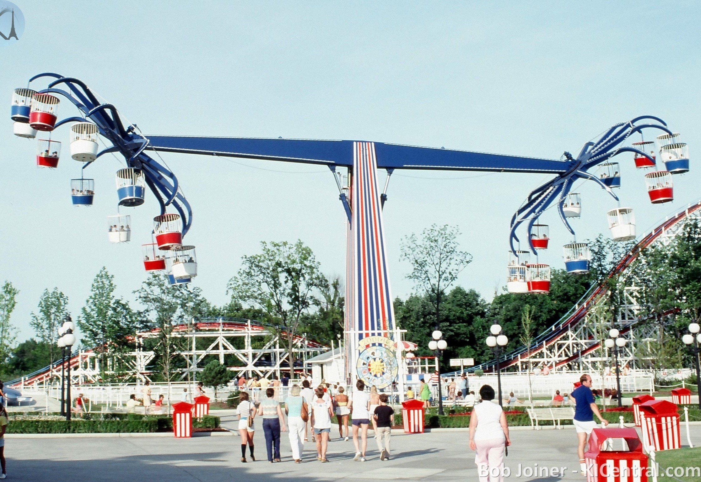
3 pointsPossibly so...I know they sent parts from World's of Fun to valley Fair a few years ago I think when world's of fun lost the "octopus" monster ride. I'm still curious whatever happened to the one Dorney removed a few years ago? Honestly the fact the one at Kings Island is an opening day attraction and came from Coney Island is probably the only reason it's still getting invested in to be kept around. Glad Kings Island is trying to keep it going. Arguably there is no flat ride more beautiful on a midway than an Eyerly Monster (other than maybe a classic carousel)3 points
-
2 points
-
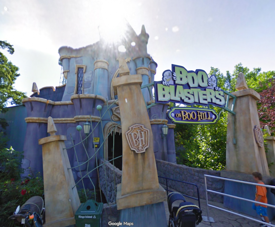
So I'm digging the color scheme. I am still on the band wagon of they should have gotten rid of the castle and made a custom facade for the building but hey I get it sometimes you just repurpose what you already have. For reusing the castle it looks pretty darn good. Love the new colors and the treble clefs on the towers are spot on. I do think the wooden slats with the eyes cheapens the look (has really bad boo blasters vibes for me). Overall looks decent and I hope at a minimum they got rid of that stupid mouth with the teeth you walk into...like replace it with theater doors at least please. What kinds of theater haunted or not has a giant mouth with teeth as the entrance?2 points
-
1 pointACE Eastern Great Lakes had planned on an event called KingsCon at KI in late May. This is now canceled due to high cost. I know enthusiasts are a small part of the population of park goers, but for this region of ACE to be this blunt does not bode well: With registration opening on Day of the Dragon and Bonus Round, we unfortunately have to announce the cancellation of KingsCon, our 2026 event at Kings Island. As we've stated before, costs and pricing are rising everywhere, but the cost for ERT quoted by Kings Island was significantly higher than ACE can afford as a 501(c)(3) non-profit. While we hope that we can continue working with the park and maintain a relationship that dates back 47 years, an annual event is not possible with the prices and minimums the park has in place. We're sorry for those of you who were excited for another Kings Island event like we were, but we hope to still see you at one of our many regional events this summer. Kings Island: don't bite the hand that feeds you. You may save nickles on the front end, but you will loose dollars on the flippity flip. BTW: It is now the end of March and nothing has been said of Coasterstock '26 that i know of.1 point
-
1 pointI'm just wondering if the rabbit with deer antlers was intentional in the prompt or if it was another AI slop mistake.1 point
-
Anyone else think that Cedar Point Monster is possibly becoming a parts donor for the KI one? Cedar Point ride still had the skirting around the base to hide the motors...wonder if we will see any improvements like that on the KI one as the one at CP was removed? Also worth mentioning the CP one had lights on the center dome shaped piece unlike the KI one. It was a "more complete" looking ride. Would like to see KI get the spare tubs and parts... Black with the yellow red and orange tubs could be a cool new look but for God's sake take the stupid eyes and mouths off... The monster isn't a dang kiddy ride1 point
-
Why bother keeping trees when people will buy passes anyway? Sure, the park resembles a parking lot, but... 🙄1 point
-
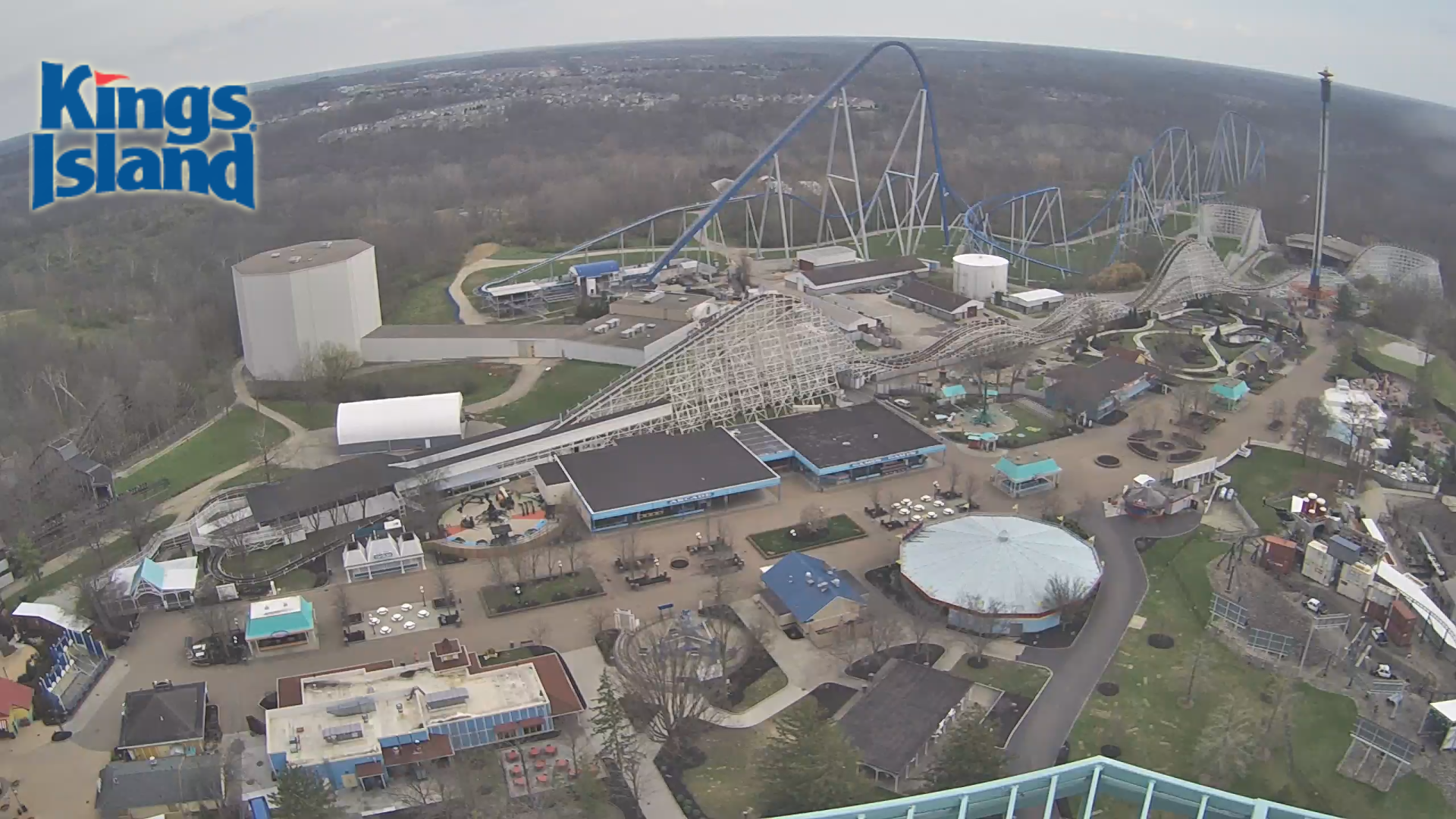
Whirly birds and racer currently running. We're getting close!1 point
-
I think it will definitely look better if/when the foliage grows in. Removing the eyes does make the windows look a little plain, but the issues with the parapet could be solved by adding a roof trim like the original had. It could either be flat (like the image below) or still be curved to go with the rest of the current structure. The rubble and missing stucco details are fine IMO. They add to the rundown look the ride is going for. (I think this image was made by either BryanJay or Hawaiian Coasters 325, sorry if I got it wrong though!) One thing that keeps getting me is all of the people who are baffled to see that the ride will have a very cartoon-y art style. I completely understand why they wanted a more refined look, but this should not be a shock to anyone who's seen the singular piece of promotional art that's been used for the new ride since August.1 point
-
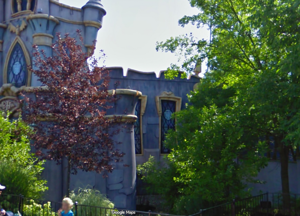
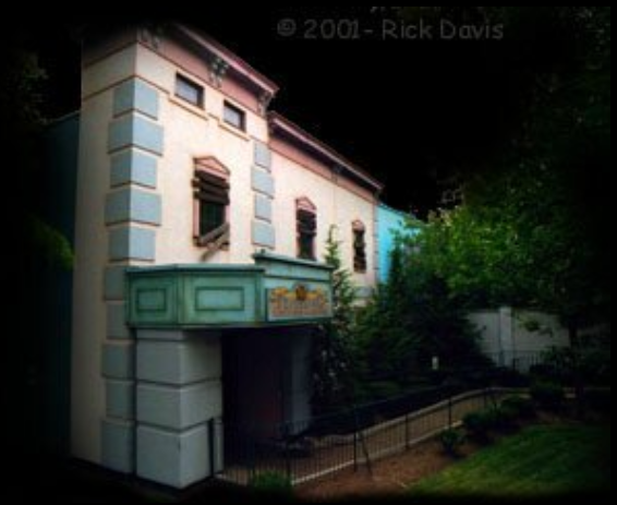
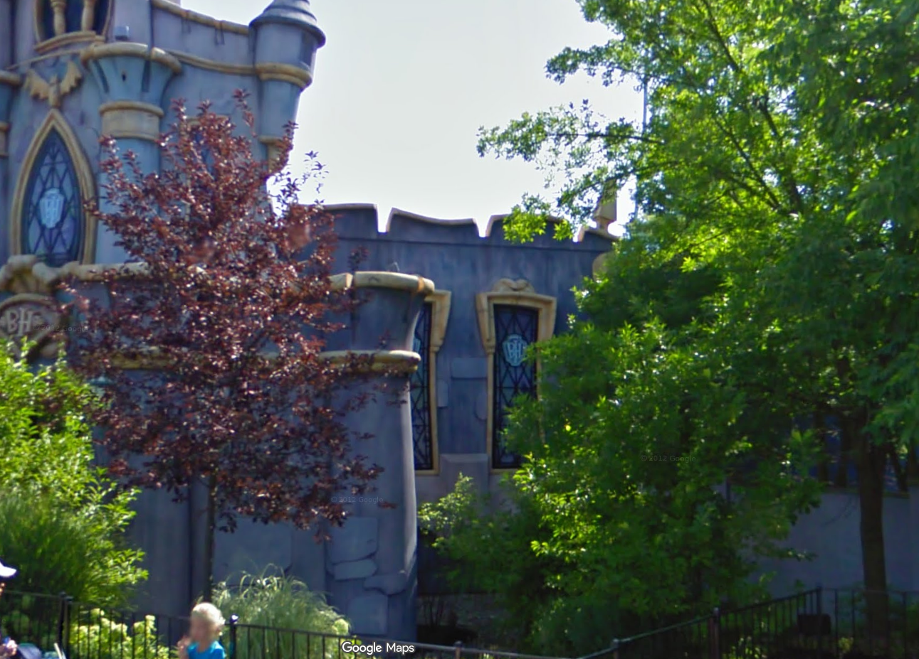
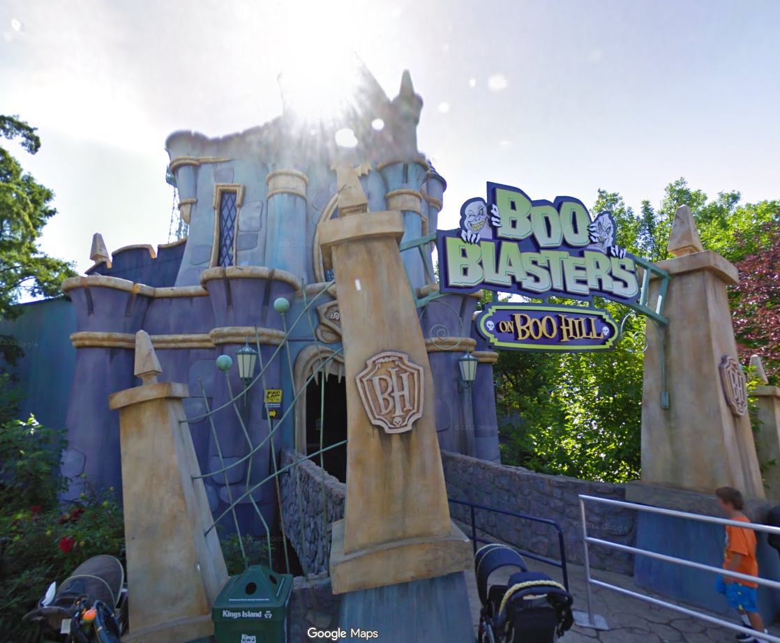
I like the new color scheme more than I thought I would. Would it have been nice to see bigger changes to the castle? Definitely, but I still think it's a lot better than what was there for 15 years after nothing substantial was changed for Boo Blasters. The view of the right side windows was more hidden during its time as Boo Blasters. It's possible that once the new foliage grows in it will be covered more. The eyes give me Scooby-Doo vibes more than anything, which is a nice little callback if anything. The center-left pillar of the entrance Finally, a look back at the original facade. I don't think they would have ever sprung for something this realistic when the new ride is already so much more cartoon-y than the original. That's fine with me. (Photo: Rick Davis via DAFE)
 1 point
 -
1 pointLove the concept! I would absolutely love to see this! Only issue is the terrain bunny hills going through Banshee's lockout as that would interfere with Banshee. Thread the end of the hills back in between Banshee and The Bat and have a turn around across the road there that goes into the brake run.1 point
-
I also noticed that the lower left “Tower” isn’t fully painted red while the right one is. Left Vs Right There are better pictures1 point
-
I don’t mind the look of the refurbishment, even though it still has a castle look. One thing I did notice is at the very end of the video, you can see a No Legs Larry Tragedy “mask” (Below).1 point
-
I don’t like the eyes or the notes, the rest of the facade looks solid though. I’m not sure if it’s the finished landscaping or just a result of construction, but I love how deserted it looks. I actually really like the flashlights pointing at the sign, I think it’s clever. I’m curious what logo they’ll use.1 point
-
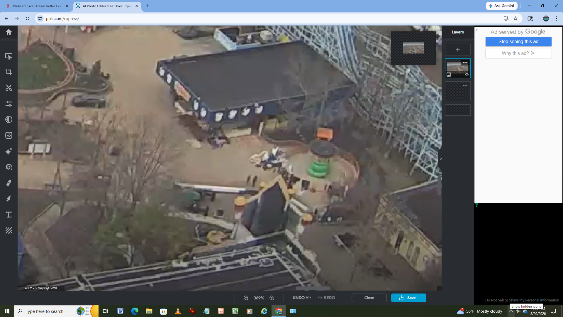
There seems to be a boom truck of some kind in the Monster area
 1 point
 -
1 pointFor what it's worth, ACE held an event (ERScream!) at KI last October. It seemed well-attended, but the weather was poor. At dinner in the picnic grove, park manager Tony Carovillano announced the park would be closing early. This was a bummer and meant no haunt attractions, but was understandable due to the weather. Overall it was a good event with a slightly disappointing ending. I was looking forward to KingsCon as a follow-up event, especially with the uncertainty about Coasterstock this year. If they do have Coasterstock, I wonder what the price will be.1 point
-
1 pointAgain not sure what happened 15+ years ago at the park that obviously some people still have negative feelings about but I can say that the park was noticably more likely to work with enthusiast clubs while @DonHelbig was with the park especially compared to their current leadership. I think ACE and GOCC and other groups have had issues with their connection with the parks disappearing as people like Don move on or get replaced. The relationships are no longer there and Enthusiasts are treated the same as a company like P&G or GE or Kroger trying to rent out space in the park. Traditionally enthusiasts were often given special privileges and pricing and the new leadership doesn't have good relationships with the club representatives therefore organizations like ACE get treated the same as any large cooperation - if you can't put up the money or the numbers to meet the minimums the park is not going to do anything for you anymore1 point
-
So have I. I’ve also noticed some general work around the fountains. My guess is they’ll start filling the area with water in the coming weeks if not already.1 point
-
1 pointI have tried a few times to have a KIC event at the park. When the price comes back, I just couldn't justify charging KIC members the amount it would take just to break even for the event. Plus, getting the minimum people to pay for the event I did not think was achievable with the cost. That was just just for 1 ride with ERT and 1 meal for the day and no guarantee the guest speak would be there. It's just not practical any more. I understand ACEs frustration.1 point
-
Double post for my fellow webcam watchers: It looks like the ATLA/waves scrim wraps on Surf Dog have been removed. I'd love to see new scrims go up to make the ride look better. There's also a small crane between Franklin's Flyers and Beagle Scout Acres (it looks like the same crane that was next to Monster a few days ago). If there used to be a tree/bush to the left of the PS restrooms like I thought there was, it's gone now. I haven't seen much movement by Phantom Theater this week so I think they're done painting. There look to be little posts for a fence near the new concrete pad but I can't tell for certain. All of the Winterfest sheds were removed from International Street on Monday. I think the Scrooge's Sausage Haus sign is still up on Grain & Grill. The Royal Fountain looks like it's being prepped for filling. The main park sign has not yet been put back up. WindSeeker tested earlier today with the gondola sitting at the top of the tower for about 10 minutes. Zephyr's central steel tower has been reinstalled, though the rest of the ride must still be backstage. Monster's fence remains in place and will probably continue to stand until the park knows for certain that it'll be up and running. The Kings Island park map is still the 2025 version. I don't expect to see the 2026 map released until either April 10th or Opening Day. The events calendar hasn't seen any more surprise changes since yesterday's Star-Spangled Night change. No live entertainment offerings are listed, but I think it's been confirmed that HiFi Honey will be performing in the park for a few days again this season.1 point
-
To be fair in 2016, KI really only put on select day/weekend pop up events or events put on by outside companies (SpiritSong and JDRF) in 2016. Interestingly, JDRF isn't doing their walk at KI this year and is instead doing it in a different location. I wonder what the deal is on why they moved it? Also ACE had a planned event this spring that was cancelled bc of rising costs to do it at KI. I wonder if that is also the reason for JDRF moving. I would love to see events like dive in movies and Island Nights return to Soak City as well as passholder night ERT events. The cost to do these pop up events can't be that much and would drive attendance. So I don't understand why the park just wants to do the bare minimum. They need to be thinking outside the box and they used to have people that do that.1 point
-
1 pointThe two arches on the left have been uncovered now that the park is working to de-winterize the fountain. I think one reason they're covered in the Winter is to block them off from the ice skating rink, but I'm not certain. The rest of the fountain appears to have been partially cleaned as well. Another thing I noticed on the webcam is that they've finally removed all of the artisan sheds from around the Eiffel Tower. I wonder why it took so long to remove them? Maybe they were using their normal "home" space for something else. On my recent trip to Kings Dominion for their Opening Day, I saw that they might actually have a space that is the closest you can get to the Royal Fountain out of the three parks that have one. I think it was at most 1.5ft from the rim of the fountain to the curb of the path where those tables are. The 2019 jut-outs at Kings Island might get that close, but it looked like the KD one got closer.1 point
-
Looks like the top of the castle has been painted a browinsh/goldish color
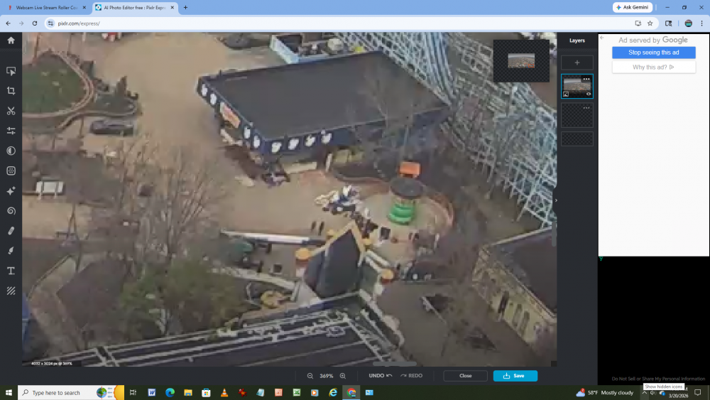 1 point
 -
I think that is 100% what they'll be doing, it's just upsetting that they can't figure this kind of stuff out to be released in January. I'd love to see a big America 250 celebration as well. Someone either here or in one of the Facebook groups claimed that a higher-up or spokesperson said this will be the last year for Carnivale, but I think it'd be easier to revitalize the entire event (while keeping the name and theme) than to bring in a whole new one. I saw someone else say that Kings Island just brings the same back every year; but isn't that how seasonal festivals usually work at regional parks like Kings Island? As for the Passholder Preview hours, that email said they won't be published because the park isn't open to the general public. I believe they might make it "official" on the events page. If I saw correctly, Dollywood required their passholders to make a reservation for the 2026 Passholder Preview. I don't think that's what Kings Island should do, but they do need to find a way to make it less hectic and/or bring the crowds down. Maybe only have it open to those who purchased their pass in the first month of sales? That would make it more exclusive while rewarding those who purchase early. The Bands In Residence concert series would be very as long as they don't take away from the existing entertainment to do it. KI needs more entertainment offerings, not less. Bringing back stuff like the races and some exclusive events would be easy money for the park.1 point
-
^^And PLEASE some new music on I-street NOT the Jazz again!1 point
-
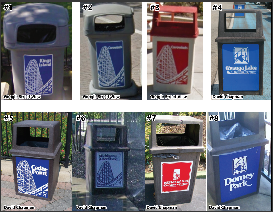
1 pointTrash cans: the useful waste bins that help to keep refuse off the paths and out of sight. Some guests would never think twice about how a trash can looks, so why should anyone care? What does a trash can have to do with how a park looks or feels? Well, it turns out that a nice looking waste receptacle might actually do a lot of good for an area. It can be used to beautify sightlines by making itself less visible across a wider view, or as an easy reminder of what area you're in (think about the bins on International Street vs. Camp Snoopy vs. Area 72). A well-designed bin can block the sunlight from heating the trash inside it while also keeping some smells better contained. Something I've wondered for a while is this: What roller coaster was used as the inspiration for the Cedar Fair trash can decals beginning around 2008? The different variations of the Cedar Fair icon show a mix of generalized steel and/or wooden roller coasters. There is also a non-descript "roller coaster and waves" logo that I've most associated with Dorney Park. After the Paramount Parks acquisition and CF park logo standardization, one specific decal began to pop up on every new trash can until parks like Kings Island and Carowinds started to introduce metal trash cans that looked more refined. We can see that the roller coaster depicted on these bins is clearly wooden (or has a wooden structure) and has a lift hill that drops toward a left-hand turn. It isn't entirely straightforward since the area where the drop might connect to that turn seems very tight, but part of me wants to chock that up to artistic liberties. Could this be a generic "coaster" only designed for this graphic? Yes, but I want to make sure. Bin #1 at Kings Island and its counterpart from Carowinds (#2) were introduced sometime between 2008-2011 after the new park logos were finalized and put into use. I believe bin #3 is a former Geauga Lake trash can (#4) brought in after that park's closure, especially since it resembles the pre-Paramount Cedar Fair trash cans with a new sticker. #5 is a rebranded Cedar Point bin while bin #6 shows a somewhat unique white background variant of the decal. Bin #7 from Worlds of Fun uses the 2008-ish Cedar Fair logo and includes the "Cedar Fair Entertainment Company" name in smaller print. Dorney Park's bin (#8) uses the amusement/waterpark icon also seen in bin #4. So far I've ruled out: Mean Streak, Gemini, Cedar Creek Mine Ride, Blue Streak, all Woodstock Express clones, all Racer variants, Son of Beast, both Hurler clones, Zach's Zoomer (MAdv), Prowler, Timber Wolf, Excalibur, Renegade, Grizzly (CGA), and Mighty Canadian Minebuster (CW). I could see an argument for: a heavily stylized and reduced Beast, a stylized Shivering Timbers (looking at the lift from the helix), High Roller (again, missing the station and looking at the lift), GhostRider, Grizzly (KD), Wilde Beast (CW). (All being stylized and generalized in some way, shape, or form.) This could absolutely turn out to be a nothing burger. If it really was just designed for the bins then I'm still at least holding out hope for my KI Fun & Safety Guide research. Kings Island has had a number of trash can designs around the park since 1972. During the Taft/KECO era each land seemed to have its own bin design. It appears that trash cans may have been standardized during the Paramount era, but I haven't seen enough to say for certain. Cedar Fair obviously brought in a ton of trash cans, even slightly changing designs around 2008-2011 and again in 2020. Festhaus received its own style of bins during it's most recent refresh. The new metal bins started to pop up around the park around 2022 and look really good. I wish the brown ones on International Street had some decals on them. Some I-Street text (as seen on some of the 80s maps) would be nice to see. Do you have a favorite "look" of Kings Island trash cans?
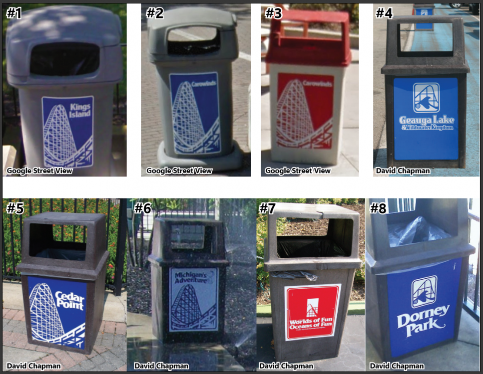 1 point
 -
I'm guessing landscaping or maintineance people doing work at the autos.1 point
-
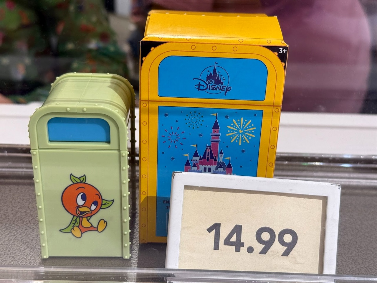
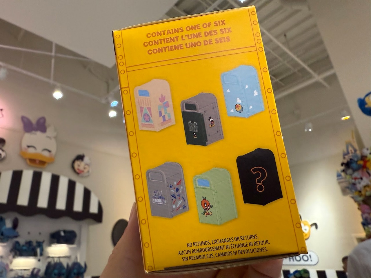
1 pointAs asinine as it may be, there may be an ROI on theme park trash cans, outside of adding to the park experience… Read More About Disney Trash Cans, I Guess

 1 point
 -
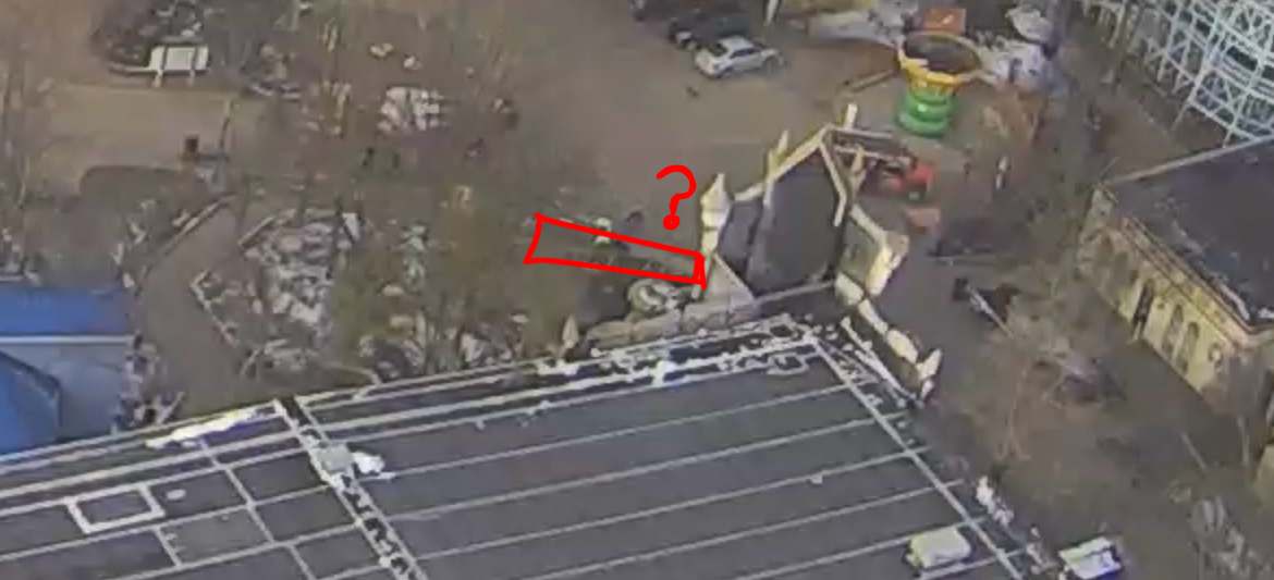
I know I’m a little late to this, but am I the only one that think these “trapezoid things” have been removed? It really looks like it but I can’t tell if it’s the camera blur or just my eyes deceiving me1 point
-
1 pointI think it was funny how they mentioned Boo Blasters in the que! My prediction is somehow Boocifer is the villain in the ride! 🤣1 pointAnother update which I think was mentioned already, but the ride will officially be open for opening day and for passholder previews. I’m not expecting a charity thing at this point, but who knows. Tomorrow is Friday the 13th so maybe they’ll launch something?? I was nervous hearing about this event today, but I do appreciate their respect for keeping most of the surprises until opening day (because even without seeking them out I definitely would’ve gotten spoiled if they showed everything off by now) and this was a fun (hopefully close to final) update to tide us over until opening day.1 pointI had been trying to avoid spoilers but I couldnt help myself seeing the pictures today! I absolutely love the theming and it seems like they are putting a lot of effort into this, even more so than when it was Scooby-Doo and even the original PT. Also the animatronics look amazing! I'm glad that Maestro is back in his booth, the only thing I'm hoping for now is that the new ride will be as dark as the original. I love when dark rides are well basically dark, fingers crossed they brought that element back. Nonetheless I am still excited! 😊1 pointWEBCAM WATCHERS I think I see some new white paint on the Snoopy side of the castle!
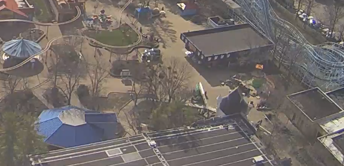 1 pointThe entire quote from Act II Scene VII in As You Like It if anyone would like to read it (credit to https://poets.org/poem/you-it-act-ii-scene-vii-all-worlds-stage). Shakespeare is always nice to read every once in a while. As for the media tour:1 point**DOUBLE POST** Add Kings Dominion to the list of the parks doing Bands in Residence. Also it's cool they're doing a Circue show in the KD theater.1 pointI wonder if the cherry picker is being used for fixes to the facade or if it is entirely what they're using to paint the castle. Right now it looks like it's actually closer to the top of the "gate" where the Boo Blasters sign is/was. Maybe they're working on that before they can work on the big mouth entrance. What I'd give to see something from the ground right there. About a month ago there was a comment from John Reilly on how Magic Mountain was planning to save some money in the long term by purchasing their own boom arm cherry picker, so now I'm curious if Kings Island would do the same. Most of the time I see one in the park it looks to be from Art's Rentals.1 pointI know its probably been discussed before, but I truly believe they should have concerts at Timberwolf again. Bring in acts (local and/or national) that draw crowds and give that space some use!1 pointYeah we need more people like Jeff running these parks! I think all regional GMs and park managers should take notes from him! I mean they usually bring in Hifi Honey and River City to do shows opening weekend and those weekends up until Memorial Day. I've said it before and I'll say it again they need to branch out and bring in more local bands than just those 2. Spread it out and maybe have one band in Festhaus, one on bandstand, and one on top of the bar in Action Zone (like Carowinds does). Then you also have some acoustic artists come in and do sets in the gazebo by Diamondback and the Mercado patio.1 pointNow that you mention it, the image does remind me of the 2016 website (the second image won't load for me so see below)! The new ads all look like the legacy Six Flags ones to me with how they use different fonts/stretched fonts for emphasis. The differently sized dots (at the bottom) is also a legacy SF thing I've noticed. I think it would be nice to see more photos from inside each be used for promotions (see below for this as well), but I understand that's probably because of how Six Flags does their standardized promotional image templates at the corporate offices. I wish they could've gotten a new promotional image, though. That one from August is feeling a little too overused. I'd love to see how the Silver Pass sells from year to year, especially now that Silver = home park pass, Gold = regional pass, and Prestige = all-park pass. I think it'd be better to let Silver Passes work all year with blackout dates, but maybe it wouldn't sell as well?
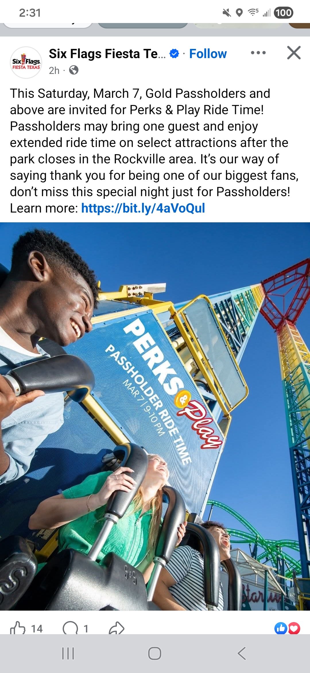
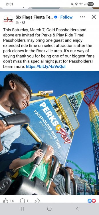
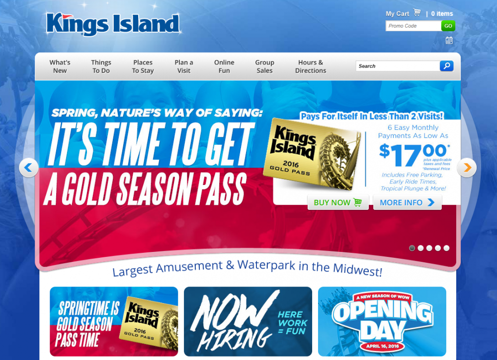 1 point#3! YEAAAAAAHHHHH! This rocks! I was just thinking not long ago just how huge Phantom Theater: Opening Nightmare could be and that it could be the greatest dark ride in the country outside of Disney and Universal. I am SO excited for it!1 pointFiesta Texas is doing passholder extra ride time this Saturday after park close. I would love to see KI bring back passholder post close ride times! Both in KI and Soak City like in pre covid years
 1 pointI can see the new concrete so much more easily now. It's not as clear, but does the new concrete look any closer to the building than before? I'd say this new portion of concrete is going to help with the extended queue on busy days, it'll help make the entrance path in to the Showplace better, and it can serve as stroller parking.1 pointI believe Tony Clark confirmed Carnivale would be back this year at No Coaster Con, but I also heard he either hinted or downright confirmed this would be the last year for it. If so why have it anyway if you know it is going to be the last year for it because we all know they'll use it as an excuse to water it down even more!1 pointCarowinds has moved their Viva La Fiesta event to be a spring time event from April 17-May 17 other than peak summer. Looks like they're counting the Splash Water Parade as the peak Summer event or they have a new unannounced event coming. If Food and Wine is coming back I would like to see KI follow suit and move Food and Wine to a few weeks earlier and have it run from like the last weekend of April through Memorial Day as that makes the most sense to hold it imo https://www.sixflags.com/carowinds/events1 pointThe issue is screenshots never accurately show any activity, but earlier in the morning they had a concrete mixing truck and people within that area. You can faintly see the truck behind the trees. I don’t fully trust that’s what it is (it seems odd to only add a few feet to the pathway) but they had some landscaping work last week that I could vaguely see on the cams.
 1 point1 pointThank you. From recollection of around 2018 and prior I never recall seeing the arches barricaded at KI. To me it looks trashy like some of the legacy six flags parks Ive been to. I agree that Canada has the most pleasing appearance of the three, but that bridge is a pain to cross. KD's version is surpassed by ours with our refined look with the decorative white pilasters vs KD's fence. However, this is subjective.1 pointThis leaderboard is set to New York/GMT-04:00





.thumb.jpeg.b3dd7ad25042e6d0d60a3b5980b4d54a.jpeg)