



Leaderboard
-
calakapepe
Members28Points3,139Posts -
Magenta Lizard
Members20Points4,284Posts -
SonofBaconator
Members14Points7,481Posts -
hosscat
Members13Points48Posts



Popular Content
Showing content with the highest reputation on 03/25/2017 in all areas
-
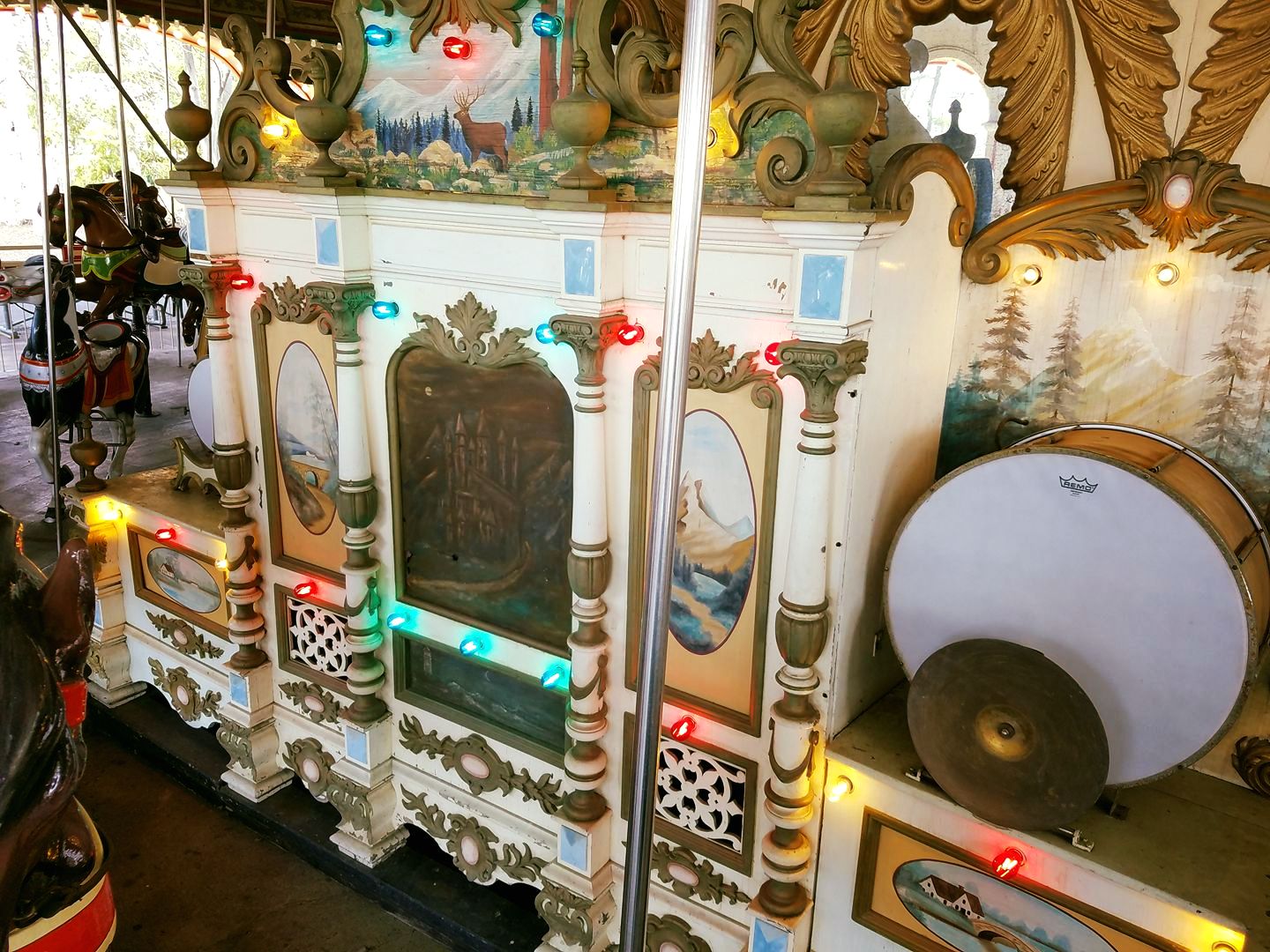
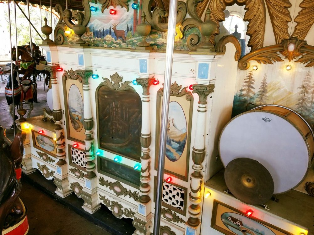
Update (6/21/17) Rolls playing: 6617 and 6627 I think I've finally got a temporary fix on the speed control. No more funeral march tempo! (Original Post) Hi Everyone! Opening day is approaching and there's a BUNCH to be excited about. As a wooden coaster fan - I'm itching to ride the new coaster, and Winterfest is going to be truly specacular... Trust me, you won't want to miss it! Anyways, I was at the park today and 2 weeks ago with a band organ restorer to diagnose some issues and between those two days - I'm pretty happy with the result. Today was a tuning day and I've now got all of the ranks of pipes playing, including the trombones which were not operating properly the past few years. Update (4/12/17) Take a look at the new lightbulbs on the organ! This pays homage to the way it looked in the Paul Eakins collection back in the 1960's. Attached below is a short audio file showing how it sounds as of today (3/24) W157 2017.mp3
 8 points
 -
7 pointsKeep in mind that the Kings Island and Miami Valley Railroad burns propane. It is not like it is burning coal like the Cedar Point and Lake Erie Railorad or the Dollywood Express. The wood on Mystic Timbers is pressure treated, so it should be able to withstand the elements, including any exhaust from the train.7 points
-
I think it was down (not keeping time, no hands) a good deal of the 2015 season, so I was pleasantly surprised with its new cement face that includes planters in the shape of letters forming "Kings Island" They definitely seem to have stepped back up their landscaping game this last season and it makes me very happy. At one point they had food-bearing plants back by the restrooms near WindSeeker (tomatoes, peppers, pumpkins). It delighted me because it was unexpected. I hope somebody had a couple dinners off the fruits before they changed it out again.
 4 points
 -
Thank you so much! I put 2 snappy rolls on and will put new music on at least monthly. There *may* even be a special roll for Halloween Haunt as I've been looking to arrange a Halloween roll. (Any tune requests?) The park already does have a Christmas roll for Winterfest from years past.4 points
-
3 points
-
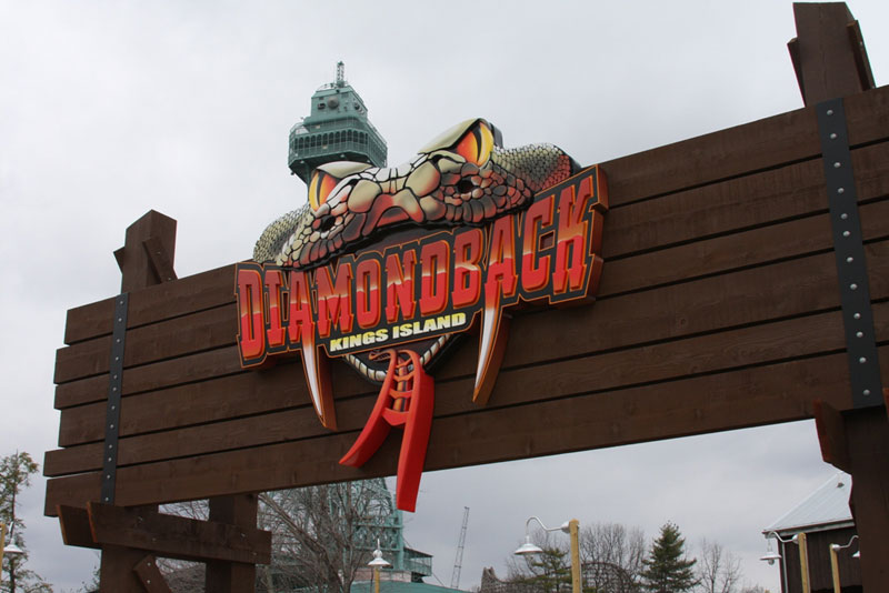
3 points3 pointsI like BLSC, so I wouldn't be happy if it were removed. I never visited the park pre-CF, so I don't know what it was like before them.2 points2 pointsAlso, there will always be heat expelling from the smoke stack whenever a locomotive is in operation, whether it's sitting still or moving. The "puffing" you're referring to is when the engineer pulls back on the throttle allowing steam to go through the cylinders and eventually into the smoke stack. To stop the "puffing" the engineer will push against the throttle so that no steam is pushed through the pistons and the train will just coast, (similar to taking your foot off of the gas in your car.) If I know locomotives correctly, and I do, I expect the engineers normally push the throttle all the way in and let the train coast into the station then open it back up slightly if needed to reach the water tower and the wheelchair ramp.2 points2 pointsI LOVE this idea! I'd even be down with this inside the TR:TR building. I'm down with this, too!2 points2 pointsGuess what everyone? Delirium's testing! Also, The Bat's just chillin' on the lift! 21 days!2 points2 pointsI've heard Firehawk (XFlight) was originally designed FOR KI in Action Zone. Paramount changed their mind after the design was finished, and Geauga Lake took it instead. Firehawk (xflight) being up for grabs years later probably made Cedar Fair easily pick KI for it, if they knew this (assumingly true) information.. Almost with a thought of "they were gonna get it anyways" sort of thought.2 pointsThanks for posting your updates to the band organ! It sounds amazing! I am so happy that you continue to work on this wonderful piece of history that the park has. It adds so much to the atmosphere! I can't wait to take my newborn son on the carousel when he is able to, just like my Dad took me on it when I was little. I always was mesmerized by the band organ when I was young, and still am today! Hmm. I don't know what you added. Is it something visual that we will be able to see when we ride the carousel? again thanks for all your hard work into restoring this for future generations to enjoy!2 pointsBut it still makes money where as a coaster wont directly create funds2 pointsThe floral clock was operational last year, along with every year before that.2 points2 pointsTruthfully I don't see any coasters leaving anytime soon. Like, I thought The Vortex looked like it was in rough shape the last time I saw it--- but I don't see it leaving.2 points2 pointsI don't think The Racer will leave soon. It's an ACE landmark. Give it some TLC? YES! New paint does wonders to any ride2 pointsNothing says majestic like a large smoking section near the carousel and non working floral clocks .... :/ Sent from my iPhone using Tapatalk2 points2 pointsI don't see The Racer leaving anytime soon. It has historical significance to the park.2 pointsGeneral rule of thumb, don't look at any comments on Facebook Public Pages....especially park pages...GP is never happy and/or looking for something out of their rants.2 pointsKings Island posted a picture of the Les Taxis on Facebook today and I didn't realize how much the GP disliked them being removed until I read the comments.2 points2 pointsWell it was there pre-cf for two seasons. Before that, it was all woods and automobiles. A lot of people favored the antique cars to the present day BLSC1 point1 point1 pointMichigan's Adventure def got the short end of the stick. They always have. When I say KI got the short end of the stick I mean KI got the worse deal outta of KD & KI. KI did get the more unique coaster, but KD got the people eating B&M floor less. I know other parks in the chain could have used these attractions. It probably would have benefited more from receiving them over KI and KD. I really only meant for the question to be why KD got the better attractions??1 pointOh I hope this doesn't fail like Banshee's on-ride video failed. Sent from my iPhone using Tapatalk1 point1 pointMack has already stated they could go over 300ft. Mack was founded in 1780, not a typo. They didn't start building roller coasters until the early 1930's. Intiman started building rides in the late 60's. The only thing I think Intiamni has on Mack is they have 2 Giga's and 2 Strata's under their belt. But Mack has said they can go over 300ft if a park wants them to. It's not like they don't know what they are doing. They have produced some amazing rides. I believe they could produce a World Class Giga. I believe their bigger Coaster are overall to expensive and a lot of the parks in the states don't want to pay that much for a ride. I love how Helix has the headlights at night and running lights on the trains. Awesomeness!! But that's just me, I'd love it if CF & KI stepped outta the out with Mack and produced the worlds best Giga. I can dream, can't I? lol1 pointTimberwolf is used for the SpiritSong Christian music festival every June. It is also sometimes used for Music in the Parks awards. Beyond that, I don't think it is used at all.1 pointJust cut out half of The Bat's queue line and then there's plenty of space. Haha! (Joking, of course.) In all seriousness, I've never paid attention to the land in AZ, so this may mean nothing- Is Timberwolf used? I've never noticed it. It COULD go in that area hypothetically.1 point1 pointDing, ding, ding! Winner! Couple things still being finalized for KI dining plans. We think you'll like what is coming!1 point1 pointIt could use a paint job and maybe they could bring back the backwards car. But the ride's not going anywhere. I bet we'd lose The Bat/Flight Deck before we'd lose The Racer.1 pointI can not think of anything that was falling apart or not functioning last season. Can you elaborate?1 point1 pointYeah, the Brady Bunch trivia is still relevant. It still draws lots of traffic, rides well, but it does desperately need a paint job.1 point1 pointWhat I would like to see is for Boo Blasters to be converted into a virtual realty ride for HH only. They could easily slow down the vehicles to lengthen the attraction (but not too slow) and the "ghosts" could be more frightening and startling than other attractions. Maybe it could follow a "paranormal activity " type theme or a haunted castle theme. Maybe it could be a random theme or maybe even change based on what the rider wants to experience.1 pointDon't know if it was confirmed lol I just thought it looked red like a red/Maroon color lol no matter what colors the trains are or aren't we will find out soon! Sent from my iPhone using Tapatalk1 pointYeah, that one was only on Snapchat so far as I can tell, and I didn't screen shot (it has since expired). My strong impression was that it was red, though.1 point1 point1 pointI thought (the letter before the E) it looked like a W... so shaggy saying "ewe" (female sheep) made me think that was what was there... Though i could see an N also.... but it looks more like a W to me still1 pointTo me, that "sheep" on MT's sign looks like (and reminds me of) Son of Beast's old baby carriage that was used in the promos and on the cover of the 2000 (iirc) park map. Also, the sign looks cool and I get what they were going for by putting Kings Island on the sign; it's like a roadside attraction sign (in a good way). Also, that dangling vine looks like tinsel and I hope it is shaped up before it opens so we can read the sign. Speaking of the sign, I agree with Shaggy''s perspective about KI being indirectly advertised (thru selfies, etc.) by being on the sign. EDIT: Also, Don; thanks for taking the time to answer our questions about this fantastic new ride! 25 more days!1 pointNot the first time! Just about branding. People are going to take pictures of the sign and post on social media, park wants everybody to know where it is.
 1 pointThere's your confirmation.. I forgot to quote you initially, so in case you miss it ^^^1 pointA sheep I think it's supposed to be like the billboard company emblem although I think it says I love sheep Sent from my iPhone using Tapatalk1 pointI do know [emoji16] they look great! Sent from my iPhone using Tapatalk1 pointGreat picture, where did it come from? If it's not yours make sure you cite where it came from. If it is yours, you may want to be careful sharing pictures of the park/new construction before it's available to the public especially if you work for the park.1 pointI was freaking out when I saw the first test run video! So close to being able to ride! 25 days.......1 point1 pointMeaning a train has been at least partially pulled up?? How do know?1 pointLocation is lousy. Ride is decent. The real problem for me is the capacity...there is what, 8 per train? The insane wait is not worth the ride itself, imo.1 pointWhy would they laugh at that suggestion? Whips are great...1 pointI mean the placement of the ride itself is the biggest upset to me. It's smack dab in the middle of the old antique cars real estate and leaves a lot of awkward, unused pieces of land. As you can see from this snip (provided by Google Maps), the red is the area that BLSC currently occupies and the blue is the wasted, in my opinion, pieces of land. The green in the bottom right corner is just extra property that could be utilized for land that could connect a coaster to the main land where BLSC currently occupies or just an area for some flats. Like I said, its the placement that makes the ride distasteful to me. There's just a lot of land that was just wasted. I honestly don't see KI getting rid of BLSC anytime soon because that would be a huge waste of money. One can only hope that Mystic Timbers takes a huge chunk of its ridership away. I'd love to see it replaced with an Intamin Blitz or even a first of it's kind B&M launched coaster, if B&M becomes more comfortable with making launched rides.1 pointThis leaderboard is set to New York/GMT-04:00